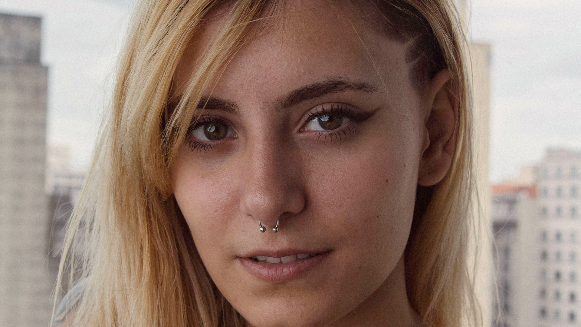

Download Assets
Download Assets
This tutorial includes 4 sample images and 4 sample PSDs. Downloads are free with a PHLEARN account.
- Download the sample images and PSDs from every free tutorial on PHLEARN
- New free tutorials published every week
- One free account — sign up once, then download anything
description
A green cast, a cool cast, or skin that just looks off can undermine a portrait no matter how good the light is. This tutorial shows how to color correct portraits in Photoshop with a Color Balance adjustment layer, working through Highlights, Midtones, and Shadows one range at a time while watching the subject’s skin instead of the slider values. Four portraits cover a mild cast, a heavy green cast, a subtle warm-up, and an underexposed shot fixed with Levels first.
Enjoying This Free Tutorial?
We publish a new free tutorial every week, each one with sample images and PSDs you can download and follow along with. Sign up and they land straight in your inbox, along with early word on sales, events and subscriber-only offers.
Image Source
Photos by Athena, Umutcan, Onur Bahadir and Collis via Pexels
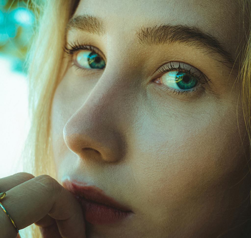
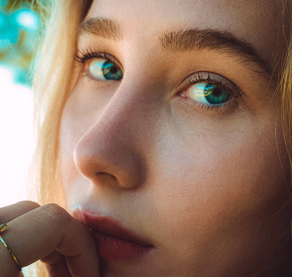
How to Color Correct Portraits in Photoshop
Bad color in a portrait — a green cast, an overly cool cast, or just skin that doesn’t look quite right — makes a subject look off no matter how good the lighting or composition is. This walkthrough shows how to color correct portraits using the Color Balance adjustment layer on four real photos, following the same core method each time: separately dial in the highlights, midtones, and shadows while watching the subject’s skin rather than the sliders themselves.
Getting Started with Color Balance
Every example in this technique starts the same way, with a single adjustment layer that controls color independently across three tonal ranges.
-
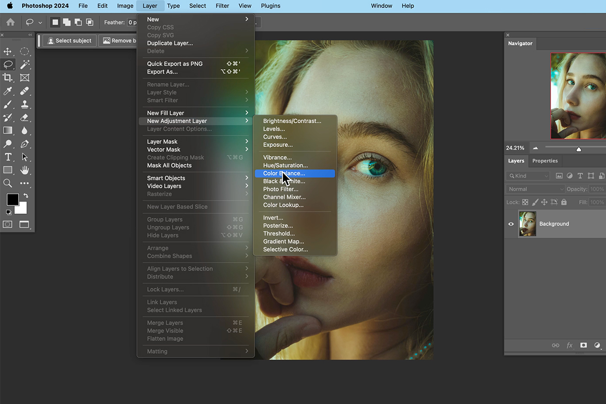
Add a Color Balance Adjustment Layer
Go to Layer > New Adjustment Layer > Color Balance and click OK.
Why You Watch the Subject, Not the Sliders
The specific slider values don’t matter and will differ from photo to photo — what matters is the visual result on your subject’s skin. Dragging a slider while staring at the number or the slider position itself is the wrong approach; the correct amount is whatever makes the subject’s skin look natural when you’re looking directly at them as you drag.
Correcting a Color Cast with the Highlights Sliders
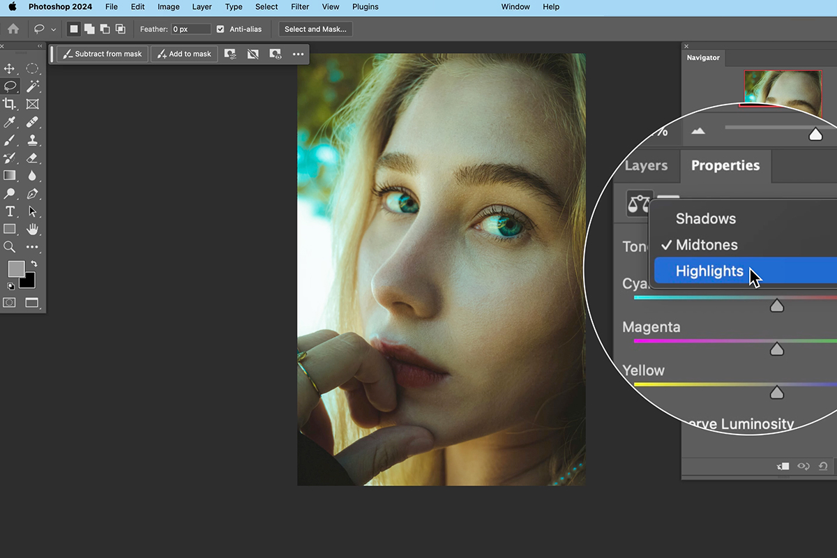
The Properties panel for a Color Balance layer offers three ranges — Highlights, Midtones, and Shadows — and each one has the same three sliders.
-
Select the Highlights Range
In the Properties panel, click Highlights to start there before moving to the other ranges.
-
Adjust Cyan to Red
Click and drag the Cyan-Red slider left and right while watching your subject’s skin — too far one way looks too cyan, too far the other looks too red, with a natural point somewhere in between.
-
Adjust Magenta to Green
Drag the Magenta-Green slider the same way, watching the subject rather than the number.
-
Adjust Yellow to Blue
Drag the Yellow-Blue slider until the subject’s skin looks natural, neither too warm nor too cool for what you’re going for.
Neutralizing Midtones and Shadows
-
Repeat the Three Sliders for Midtones
Click Midtones in the Properties panel and adjust all three sliders — Cyan-Red, Magenta-Green, Yellow-Blue — the same way, watching the subject’s skin as you go.
-
Repeat the Three Sliders for Shadows
Click Shadows and repeat the same three-slider adjustment one more time.
-
Compare Before and After
Toggle the adjustment layer’s visibility icon off and on to see the full before-and-after difference from a single Color Balance layer.
Working Through Highlights, Midtones, Then Shadows in Order
Starting with Highlights, then moving to Midtones, then finishing with Shadows keeps the correction organized and easy to reason about, since each range affects a different part of the tonal spectrum. Color is subjective, so the exact values that look right will vary from photo to photo and person to person — the goal is simply removing any color cast that makes the subject look sickly or off, not hitting a specific numeric target.
Fixing a Stronger Green Cast
A second example carries a much more obvious green color cast across the subject’s skin, requiring the same process with more noticeable slider movement.
-
Add Another Color Balance Layer
Go to Layer > New Adjustment Layer > Color Balance and click OK.
-
Work Through Highlights, Midtones, and Shadows
Adjust all three sliders in Highlights first, watching the subject’s skin closely, then move to Midtones and drag those sliders further given how strong the cast is, then finish with Shadows.
-
Brighten with a Levels Adjustment Layer
Once the color looks corrected, add a separate Levels adjustment layer and brighten the midtones slightly for a cleaner final result.
Warming Up Skin Tone Subtly
Not every correction is about fixing a problem — sometimes the goal is a subtle, intentional warmth rather than neutralizing an obvious cast.
-
Add a Warming Color Balance Layer
Add another Color Balance adjustment layer, and in Highlights, move the sliders slightly toward red and yellow for a touch more warmth in the subject’s skin.
-
Carry the Warmth into the Shadows
Move into Shadows and add a small amount of red and magenta there as well, keeping the overall change subtle rather than dramatic.
Correcting Light Before Color
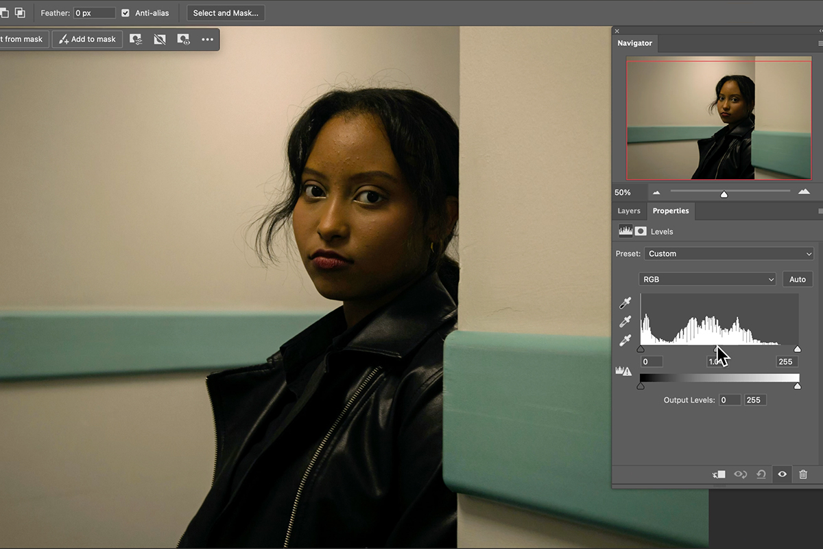
In the fourth example, the subject is significantly underexposed, so light needs correcting before color work can be judged accurately.
-
Brighten with Levels First
Go to Layer > New Adjustment Layer > Levels, click OK, and raise the light levels since the subject starts out far too dark.
-
Add Color Balance After Correcting Light
With exposure fixed, add a Color Balance adjustment layer and work through Highlights, Midtones, and Shadows as before, focusing on neutralizing the subject’s skin tone.
Revisiting Your Adjustments Later
-
Return to an Existing Color Balance Layer
Click back on any previous Color Balance adjustment layer’s thumbnail and reopen its Properties to make further changes, such as adding more magenta or less red in the midtones.
Why Fresh Eyes Matter for Color Correction
Staring at the same colors for an extended stretch can throw off your judgment, since your eyes gradually adjust to whatever cast is present. Stepping away and coming back to reassess an image with fresh eyes, then adjusting the sliders again if needed, is a normal and useful part of getting color exactly right rather than a sign the first pass failed.
Common Mistakes to Avoid
Watching the slider position or its numeric value instead of the subject’s actual skin is the most common misstep — the correct amount is whatever looks right on the person, not a specific number. It’s also easy to skip correcting exposure first on a badly underexposed image, which makes it much harder to judge color accurately, and to treat a single pass as final rather than coming back with fresh eyes to double-check the result.
More Free Photoshop Tutorials
If you found this method to color correct portraits useful, these free tutorials cover related color work:
- How to Color Grade in Photoshop using Camera Raw
- How to Color Grade Photos in Adobe Camera Raw
- Curves vs Levels in Photoshop: What the Difference Actually Is
Why This Approach Works
What makes this method reliable across four very different portraits is that it never depends on a fixed numeric recipe — it depends on watching the one thing that actually matters, the subject’s skin, while making the adjustment. Splitting the correction across Highlights, Midtones, and Shadows separately is what lets a color cast that’s concentrated in one tonal range, like a green tint sitting mostly in the midtones, get fixed precisely there rather than smeared across the whole image with a single global adjustment.
Correcting exposure with Levels before judging color, as in the fourth example, matters because a badly underexposed image makes accurate color judgment nearly impossible; you’re essentially trying to read color information that isn’t visible yet. And treating the whole process as revisitable, rather than a one-shot correction, accounts for the very real fact that your own color perception drifts the longer you stare at an image, so a second look after a break often catches something the first pass missed.
Final Thoughts
Color Balance adjustment layers give you precise, independent control over three tonal ranges without ever needing to touch a single pixel destructively, which is exactly why the same simple process scales from a subtle warming touch-up to a heavy green-cast correction. The real skill isn’t memorizing slider values; it’s training your eye to recognize when a subject’s skin looks natural and trusting that judgment over any specific number, then giving yourself permission to come back and adjust again once your eyes have had a break.
New Free Tutorials View All »




Enjoying This Free Tutorial? Go Further with PRO.
Unlock Full Sample Files, PSDs, and Hundreds of Masterclasses!

Download full project assets, original PSDs, and RAW images for every lesson
Unlimited access to our complete library of PRO Photoshop & Lightroom courses
Instant 4K Ultra HD streaming on all devices, anytime, anywhere
Full access to our entire library of Photoshop Actions, Presets, and LUTs
Flexible monthly and annual membership plans
Cancel anytime with zero hassle or commitments