Negative Space in Photography: How to Use Emptiness on Purpose
Negative space in photography is the part of the frame that isn’t the subject: the sky, the fog, the plain wall, even a pool of shadow. Used on purpose, it gives the subject room to breathe and tells the viewer exactly where to look.
- What it isThe area around the subject
- Good sourcesSky, fog, snow, water, walls, shadow
- Add it laterCrop or Generative Expand
I first learned how important empty space is from graphic design, actually. In a layout, you give an item room to breathe, and the space around it becomes a compositional element in its own right. Often the background, the nothing, becomes the object itself.
Negative space in photography works the same way. It doesn’t mean there’s nothing there. It means the main subject doesn’t take up the entire frame, and what’s left around it has a job. This guide covers what positive and negative space are, when empty space feels finished and when it doesn’t, where to put the subject, how designers and advertisers use the space, and how to add more of it in Photoshop when the photo you have is too tight.

What Is Negative Space in Photography?
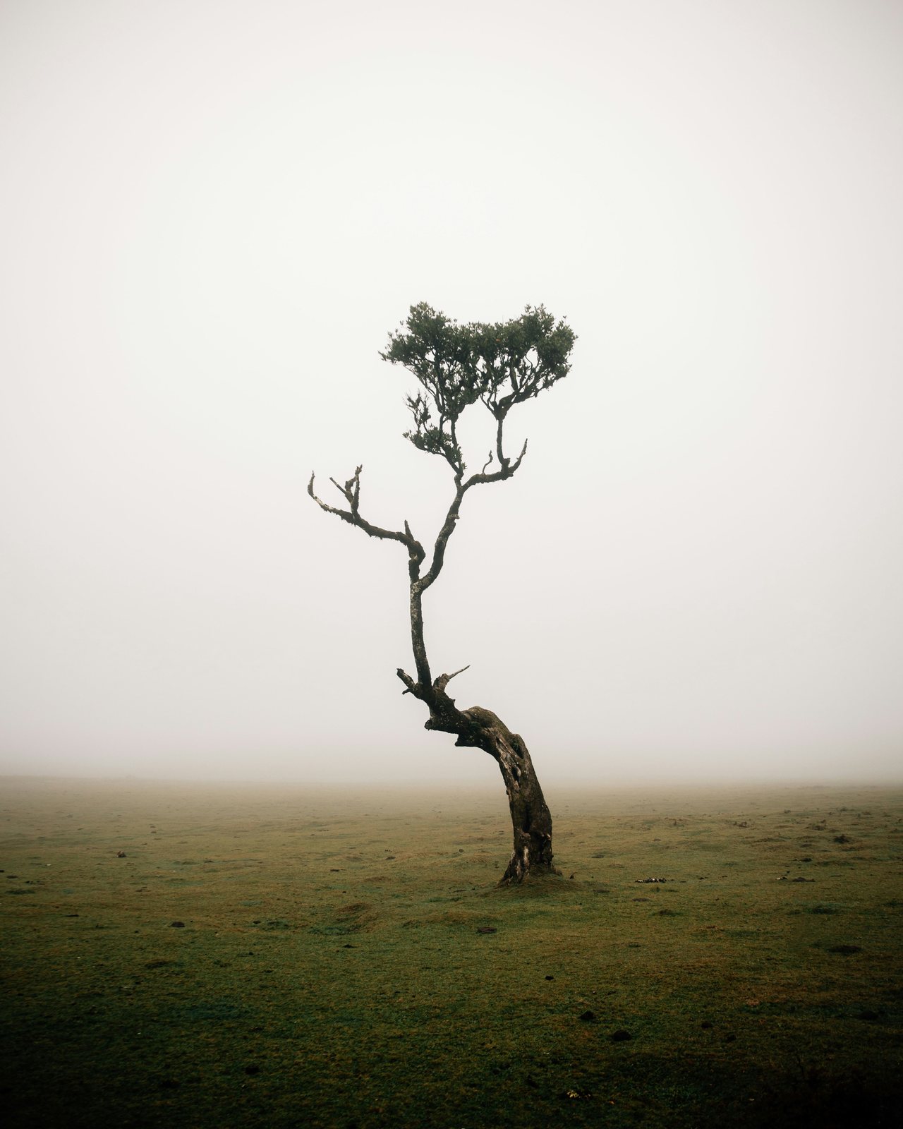
Positive space is the subject: the thing the photo is about. Negative space is everything around it. In a foggy field, the tree is positive space and the fog is negative space. The two only make sense together. The shape of the empty area is set by the edge of the subject, and the subject is easier to read when the area around it is plain. The best-known demonstration is the Rubin vase, described by the Danish psychologist Edgar Rubin around 1915: one drawing that reads as a vase or as two faces, depending on which area your eye takes as the subject.


One thing I’d suggest is looking at an image in terms of its tone values, almost as if it were black and white. Is the subject dark on a light background, or light on a dark one? Once you know, the question becomes how you can isolate the subject and include as much of that light or dark background as possible. The two-tone map above is the same idea. If the subject is one clear shape inside a larger calm shape, the negative space is working. If the map is a mess of small pieces, the frame is busy, however much sky is in it.
When Does Empty Space Feel Unfinished?
Negative space feels unfinished when there’s absolutely nothing in it and it doesn’t serve a purpose. Photographing someone on a pure white background with no other context can feel empty. Put that same person into an advertisement with words on the background, or float a product on an all-white web page, and all of a sudden the space has context and it makes sense.
A big, empty sky can feel the same way. In our Color Theory and Composition course, one example has a huge, flat sky over a small strip of ground. There’s nothing in that sky and nothing interesting about it, so the fix is to crop it down and give the room to the parts of the photo that matter.
Empty space becomes negative space when it does three things. It’s calm: one tone, one texture or a smooth gradient, like fog, snow, open sky, still water, a painted wall or a deep shadow. It contrasts with the subject, so a dark tree sits on bright fog and a bright jacket sits on black sand. And it has a job: it shows how small the subject is, gives a moving subject somewhere to go, sets a mood, or holds the text on a cover. If cropping the space away changes nothing, it wasn’t doing a job.
Negative space doesn’t mean nothing there. It just means the main compositional element doesn’t take up the entire frame.
Aaron Nace
Where Should the Subject Go?
There’s no right or wrong answer, but a few starting points work almost every time.
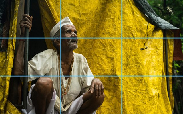
Off center, on a third. A subject in the middle of a big empty frame can work for symmetry, but it often looks static. Move it to one of the lines of the rule of thirds and the empty side starts to feel like a choice.
Space on the side the subject faces. Wherever your subject is looking, leave more room on that side. Camera operators call it lead room. A person looking into the frame looks thoughtful; the same person facing the near edge, with all the space behind them, looks like they’re about to walk out of the picture.


Room to move into. A boat, a runner or a bird needs space in front of it. In our Fundamentals of Composition and Light course, a rowboat crossing a foggy lake sits in the middle of a very wide frame; trimming the space behind it and adding a little in front gives it somewhere to go.
Breathing room at the edges, and a horizon off the middle. A head or a mountaintop that grazes the top edge looks like a mistake even when everything else is right. A low horizon gives the negative space to the sky, a high one gives it to the water or the snow, and a horizon through the middle splits the frame into two halves that compete.
Minimalism and Scale: When the Space Is the Photo
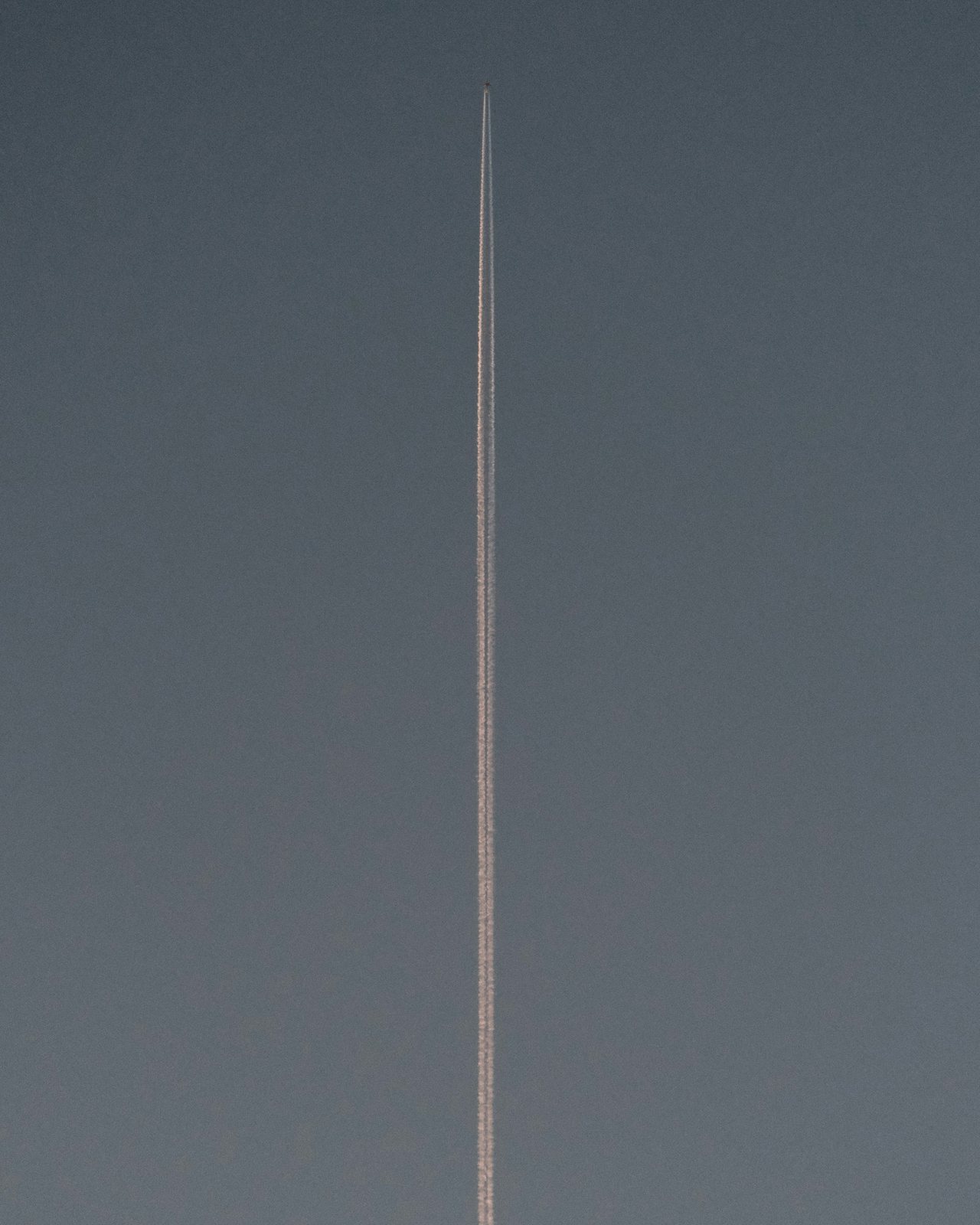
Minimalist photography takes negative space as far as it goes: one subject, one simple shape, one background tone. It’s the easiest version to get wrong, because there’s nothing to hide behind. Two trees compete. A stray branch in the corner, or a speck of dust on the sensor, becomes the second subject. For minimalism taken all the way, read our interview with the Spanish photographer García de Marina, whose photos often come down to one object and a plain background.
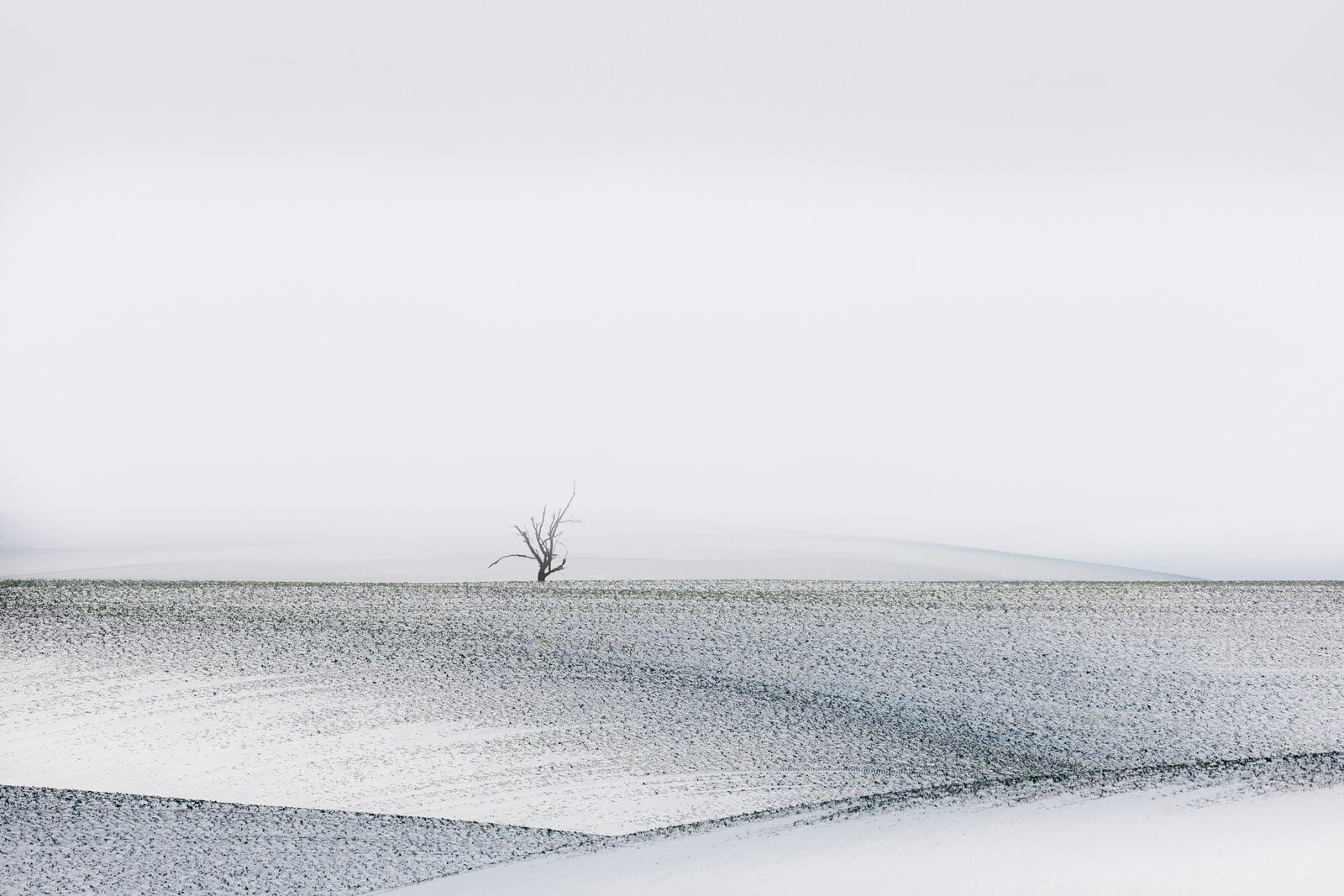
Scale is where negative space starts telling a story. A person who fills a third of the frame is a portrait. The same person as a dot on a snowfield is a story about distance, weather and being alone. Scale works when the subject is something people know the size of, like a person, a house or a boat, and when it’s the darkest, brightest or most colorful thing in the frame. Don’t make it so small it disappears on a phone screen: most people will see your photo a few inches wide.

Negative Space for Text and Layout
In commercial work, images need negative space because that’s where the type is going to go, along with any other graphic elements. Advertisements especially need empty space so the same image can fit several different layouts: a cover, a poster, a website banner, a social post. Stock libraries even have a name for it: copy space.
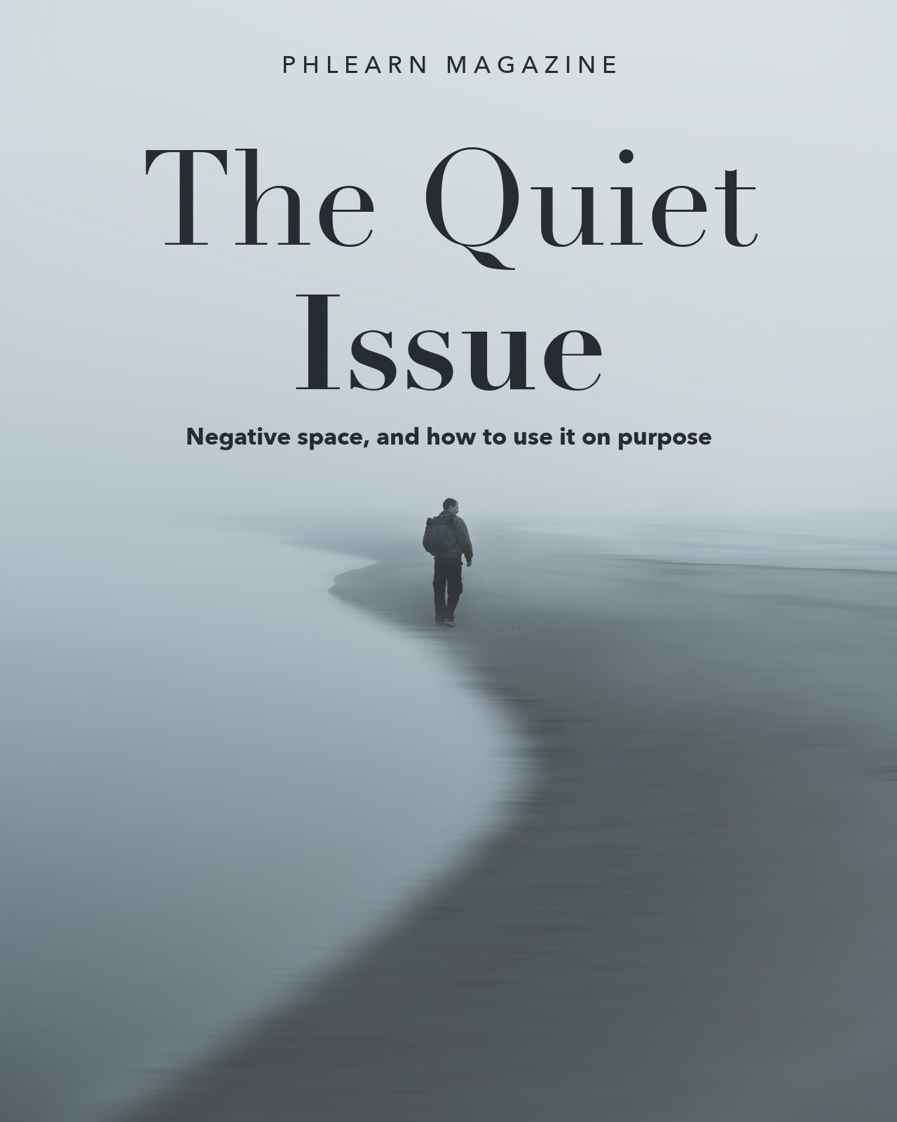

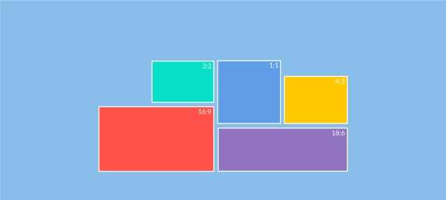
What’s interesting now is that we live in a time when Generative Fill and AI are everywhere. Capturing negative space in camera for advertising isn’t always necessary anymore, because you can generate it in any dimension and in any aspect ratio you want. That has changed a lot. Negative space in photography still works as a compositional element, though. If you shoot for clients, shoot the scene with room on both sides and above, keep the subject away from the edges so it survives a wide crop and a narrow one (check the aspect ratio each place needs), and keep the text area smooth. Fog, sky and out-of-focus backgrounds take type easily; grass and ripples don’t.
How to Find Negative Space When You Shoot
You rarely find a perfectly empty background. Most negative space comes from where you stand and how far back you go.
- Change your height. Get low and the sky becomes your background. Get high and it becomes the ground, the water or the floor.
- Use the weather. Fog, mist, snow and a flat overcast sky erase detail. They’re the easiest negative space there is, and the days most people stay home.
- Use light and shadow. Negative space doesn’t have to be a physical thing. A streak of light across a city street, with the rest of it in shadow, creates negative space too.
- Blur the background. A wide aperture and a longer lens turn a busy background into a soft wash. It still counts if it’s smooth.
- Expose for the bright space. Cameras meter for a middle grey, so a frame full of snow or fog comes out grey and dull. Add about +1 stop of exposure compensation (up to +2 for bright, sunlit snow), then check the histogram or the highlight warning so the brightest areas keep their detail.
How to Add Negative Space in Photoshop With Generative Expand
Sometimes the shot is too tight and there’s no going back for another. Generative Expand is part of the Crop tool (checked in Photoshop 27.11, October 2026):
- Press C for the Crop tool.
- Set Fill to Generative Expand in the options bar at the top. Left on the default, you get empty canvas instead of new image.
- Drag the crop box past the edge of the photo, in the direction you want more space.
- Click Generate. Leave the prompt empty and Photoshop continues what is already in the photo.
- Look through the variations in the Properties panel (Window > Properties) and pick the one with the calmest new area.
Generative Expand runs on Adobe’s servers, so it needs an internet connection and uses generative credits. The result goes on its own layer, so you can mask it or try again. On a high-resolution photo, choose Enhance Detail on the variation you keep, so the new area holds up next to the original.
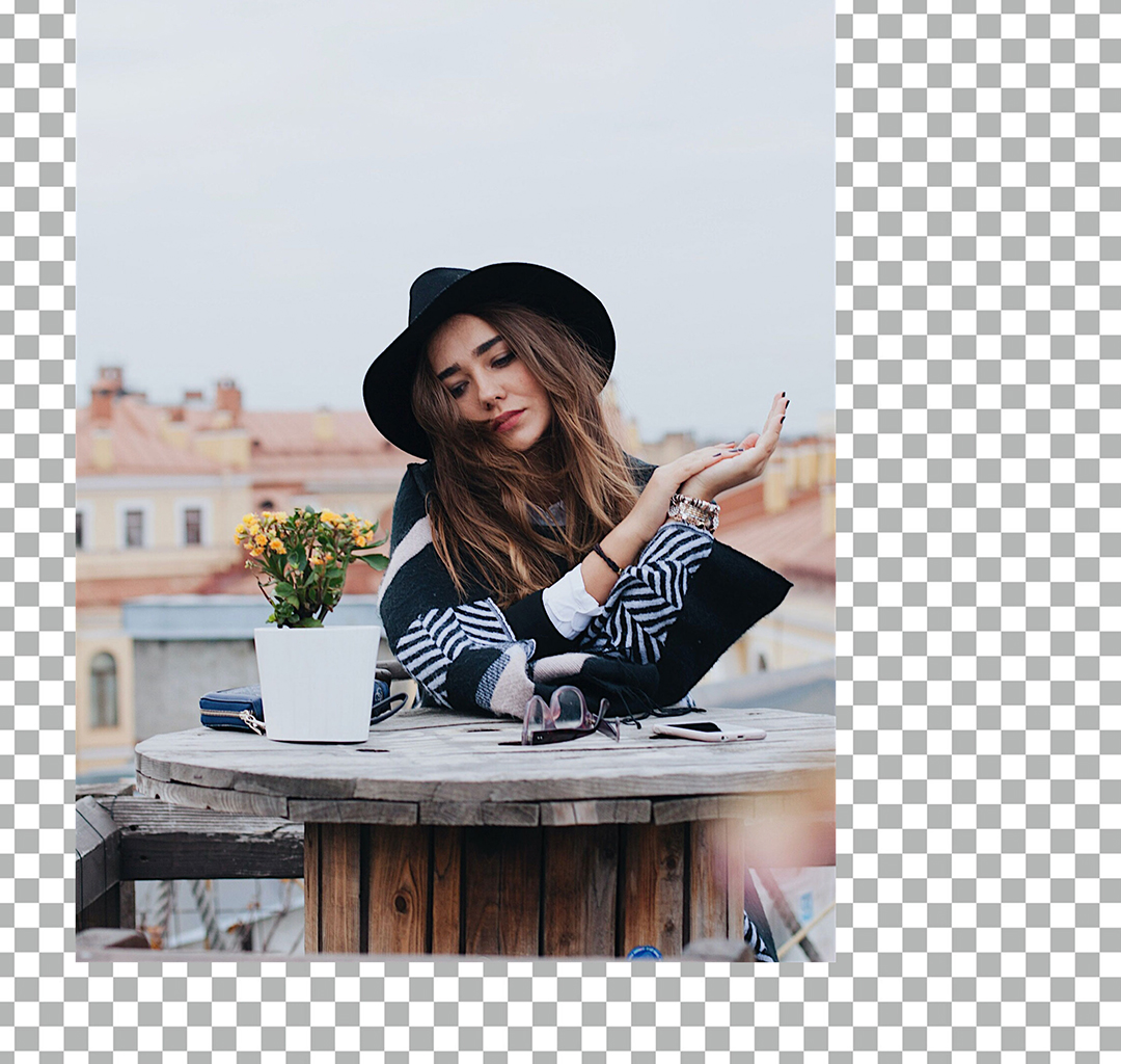

It extends the scene with content that was never there, which makes it wrong for news, documentary or real estate photos, and for contests whose rules forbid it. Expand a busy photo and you get more busy photo. For a plain sky or wall, the Content-Aware Fill option in the same Fill menu often works just as well and uses no credits, and anything you don’t want in the new area can come out with the Remove tool. Our tutorial How to Use Generative Expand in Photoshop turns one photo into a wide and a tall banner.
Five Mistakes With Negative Space
Too little space. This is the mistake I see too often. We almost have a tendency to fill the frame with everything we possibly can. That’s one way of creating a composition, but negative space lets you focus on the subject a little bit more.
Space with no purpose. A dull sky over a small subject, or a person on plain white with no context, is wasted space rather than negative space. Crop it, or give it a job.
A busy “empty” area. Distant buildings, power lines and bright patches pull the eye away from a small subject. Check the corners.
Space behind the subject. A person or a car facing the near edge of the frame, with all the room behind them, feels cramped.
Grey snow and grey fog. The camera’s meter darkens bright scenes. Add exposure, or brighten the photo afterwards.
We almost have a tendency to fill the frame as much as we possibly can, but negative space allows us to focus on the subject a little bit more.
Aaron Nace
Common Questions About Negative Space in Photography
What is negative space in photography? It’s the area around and between the subjects of a photo. The subject is positive space; the calm area around it, like sky, fog, a wall or shadow, is negative space.
How much negative space should a photo have? There’s no fixed amount. Some minimal photos are 90 percent empty; a portrait may only need a little room in front of the face. Use as much as the space has a job for.
Does negative space have to be white or empty? No. A black background, a blue sky, an out-of-focus garden or a pool of shadow can all be negative space, as long as it’s calm and the subject stands out against it.
Can I add negative space after the shoot? Yes. Crop to move the subject off center, or extend the canvas with Generative Expand or Content-Aware Fill in Photoshop.
Give the Subject Some Space
Negative space works alongside the other tools of composition. Our guide to composition rules covers the rest, and leading lines are a natural partner: a line through a calm area takes the eye straight to the subject.
My advice to anyone creating art is to give the subject some space. Things don’t always have to be so close. Next time you find one subject, make a series: one frame where it’s far away, a medium shot, then a close portrait. The farther you zoom out, the more context you gain from the environment. Put the three side by side at home and see which one you like best.
In this article
- What Is Negative Space in Photography?
- When Does Empty Space Feel Unfinished?
- Where Should the Subject Go?
- Minimalism and Scale: When the Space Is the Photo
- Negative Space for Text and Layout
- How to Find Negative Space When You Shoot
- How to Add Negative Space in Photoshop With Generative Expand
- Five Mistakes With Negative Space
- Common Questions About Negative Space in Photography
- Give the Subject Some Space
Free with PHLEARN