Histograms: How to Read Them and Use Them to Take Better Photos
When I first started my journey into the world of photography, histograms were not on my list of useful tools. I started out completely unfamiliar with my brand new DSLR and shot in automatic for my first year. Photos that looked “off” confused me, and I assumed something trivial was wrong with my camera.
My second year, I enrolled in beginner’s classes where the requirement was to shoot manually with an analog camera. I learned all about my camera’s metering system and how the exposure of my photo was determined. With my newfound knowledge, my understanding of DSLRs completely changed, and I left automatic behind at the door.
Moving forward with my camera’s various automatic and non-automatic modes, I found that I could still make drastic mistakes in terms of getting the correct exposure. It’s very possible for your camera’s metering system to be tricked by difficult lighting situations, resulting in photos that are over- or underexposed.
Enter histograms.
To the untrained eye, a histogram might look like an unnecessary and overcomplicated addition to your work process. The reality is that histograms provide valuable information that can go a long way to streamlining your workflow as a photographer.
See, while your camera might seem perfect, it’s actually capable of making mistakes. Specifically, exposure mistakes. It’s designed to get a decent exposure for any scene as a whole, but an exposure that’s “okay” for your entire image might not necessarily be “good” for the most important parts of it. Histograms were included in cameras as the solution to hiccups in their systems. In this guide, we’ll be looking at what histograms are, what they do, and how they can help improve your photography.
Let’s Talk Technicalities
Before we dive straight into explaining histograms, let’s review some of the terms and technicalities that you’ll need to remember in order to understand the tips here. If you’re already an intermediate or advanced photographer, you probably know these terms like the back of your hand. That being said, a refresher never hurt anybody.
As we talk about histograms, we’re going to be mentioning exposures a lot. In the industry, and even among hobbyists, you’ll find that photographers exchange the word “photo” with “exposure” a lot.
The truth is that an exposure actually specifically refers to two different things that, while necessary to creating your picture, is not exactly your photo.
Exposure can:
A) Refer to a shutter cycle.
B) Refer to the amount of light that reaches your camera’s sensor, or in other words, the amount of light that your sensor is exposed to.
For the purpose of this article, we’re going to be focusing on definition B of exposures.
A proper exposure captures the lights and darks of your photo in a way that looks real, or as close to real as what you actually see. This means your photos contain the right amount of blacks, shadows, midtones, highlights, and whites to make it look “correct.”
Of course, there are situations where you just don’t get the exposure correct. Maybe your aperture was opened too wide, your shutter speed was set too fast, or your meter reading was off by a few stops. Whatever the reason, the result of inaccurate settings can often be either overexposed or underexposed photographs.
Overexposed photos are photos that are too bright. They may have an overabundance of white tones and blown out highlights. You can visually pinpoint an overexposed photo by the almost faded appearance it takes on.
Underexposed photos on the other hand are way too dark. Underexposed photos have too many black tones and shadows. To the naked eye, these photos might be frustrating to look at, as you can just barely tell a picture is there, underneath all the black.
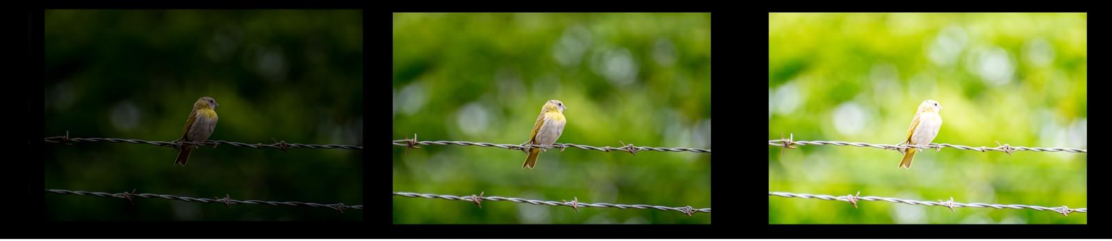
From left to right, an underexposed, properly exposed, and overexposed photo.
We’ll also be covering RGB channels, which refer to the color channels red, green, and blue. These three primary colors go into producing all of the colors that you see in your photo, and each channel of color typically has a specific histogram that can correlate with it.
It’s crucial that you familiarize yourself with these terms because they are integral to understanding how to process the information on your various histograms.
So, What Is a Histogram and Where Can You Find One?
Like anything that seems like it could possibly be related to math, histograms can look complicated and intimidating. Luckily for photographers, while the processes that go into producing a histogram involve math, reading one does not.
The basic purpose of a histogram in photography is to show you the distribution of certain values in the tones of your photo. The information displayed can help you determine the accuracy of the exposure of your picture and adjust your settings if your photo is over- or underexposed.
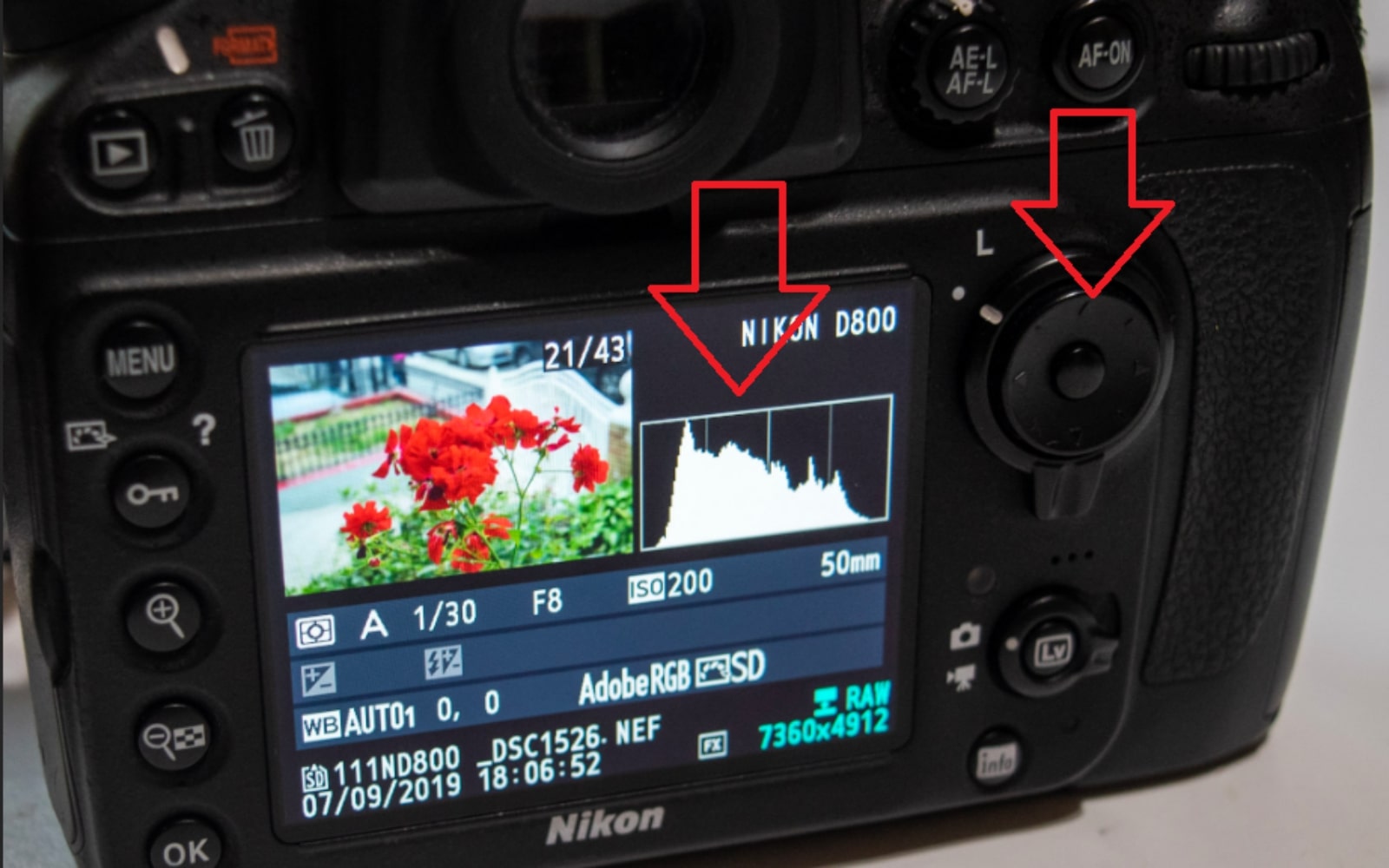
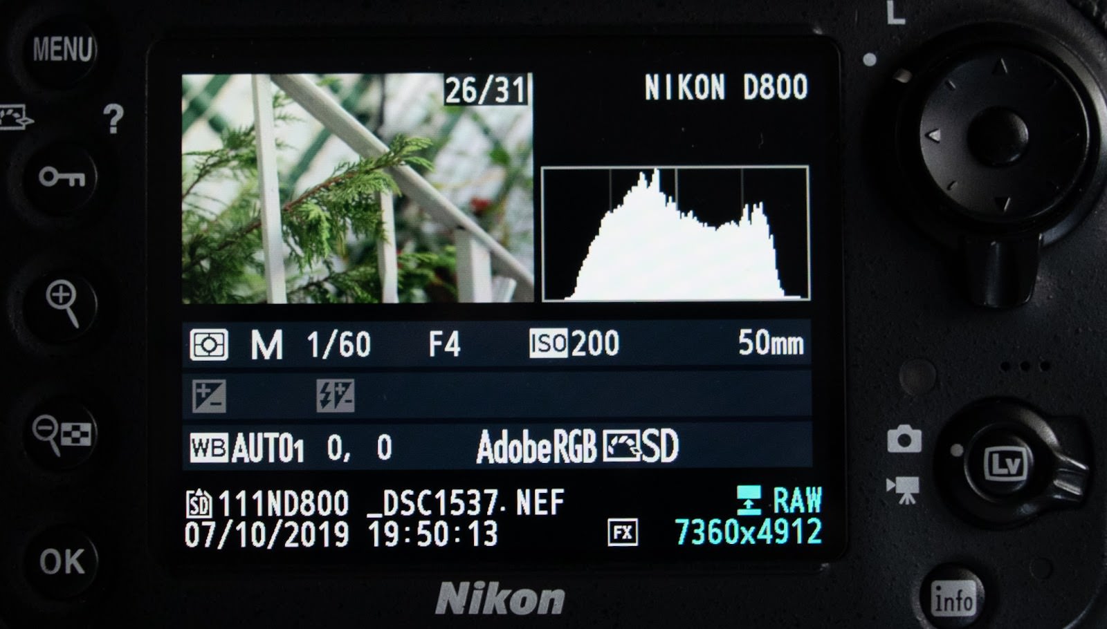
Histograms are an almost universal element of modern digital photography and can be found in most DSLRs. How exactly to maneuver to your camera’s in-system histograms might be dependent on the brand of camera. On my Nikon D800, I simply press up on the directional pad to show the default histogram.
Other brands or cameras, however, might have their buttons mapped differently. And some cameras, like entry level DSLRs, don’t have an option to show a default histogram alongside your photo. Instead, you may have to go to the camera’s color balance features to check all histograms generated by your DSLR. Either way, you should consult your camera’s manual or the brand’s website for clear instructions on how to find your DSLR’s histogram.
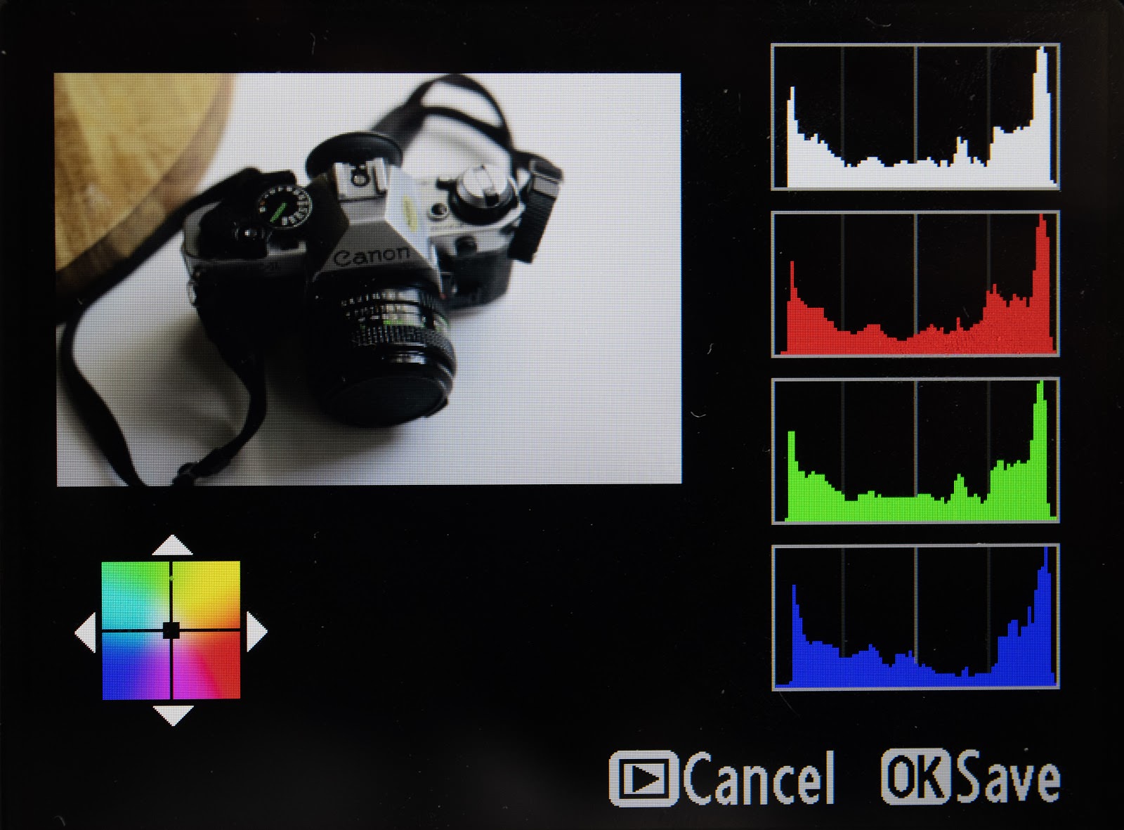
While some cameras provide their users with a live view of the histogram, these graphs are also generated after your exposure has been shot. Based on a reading of the pixels in your photos, a DSLR will typically produce four different colored graphs: white/black, red, green, and blue.
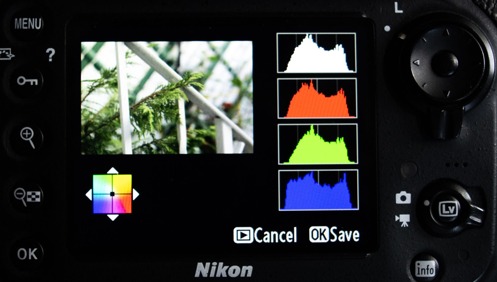
The default white/black graph details the full scope of the tones of your photo, while the red, green, and blue graphs are broken down to cover the brightness of those particular color channels.
Histograms can also be found in a sometimes more condensed version in editing programs like Adobe Photoshop and Lightroom. Although they might look a bit different, they function the exact same way as the one in your camera, and in many cases, it is possible for the program you’re using to separate them into several different histograms.
While there’s some intersectionality when it comes to reading these varying histograms, there are variations that can mean different things to the appearance of your photo, so we’ll break them down graph type by graph type, examples included!
Luminance Histograms
Histograms that read all the tones in your photo are referred to as luminance histograms. They will usually be displayed as either a white or black graph, and sometimes a gray graph within editing programs. These histograms are typically the default histogram your camera will present you with.
Tones basically refer to the different levels of brightness that can be found in your photo, and a luminance histogram shows the distribution of brightness throughout your photo.
The bottom horizontal line of the graph, otherwise known as the x-axis, shows the differing values of tones, or brightness, found in your photo. The leftmost part of this axis represents blacks and shadows; the middle represents midtones (also called medium gray); and the rightmost side of the axis represents whites and highlights.
Altogether, the graph displays 255 different tones, running from 0 (black) on the left, to 255 (white) on the right.
The vertical y-axis represents the amount of pixels that appear in your photo with that level of brightness. Higher spikes in the graph correlate with a greater amount of pixels in that tone. So, for instance, in the image above, the height of the blue graph indicates that there are many pixels in the photo of that color that register as blacks and shadows.
Reading your histogram is actually a fairly simple process.
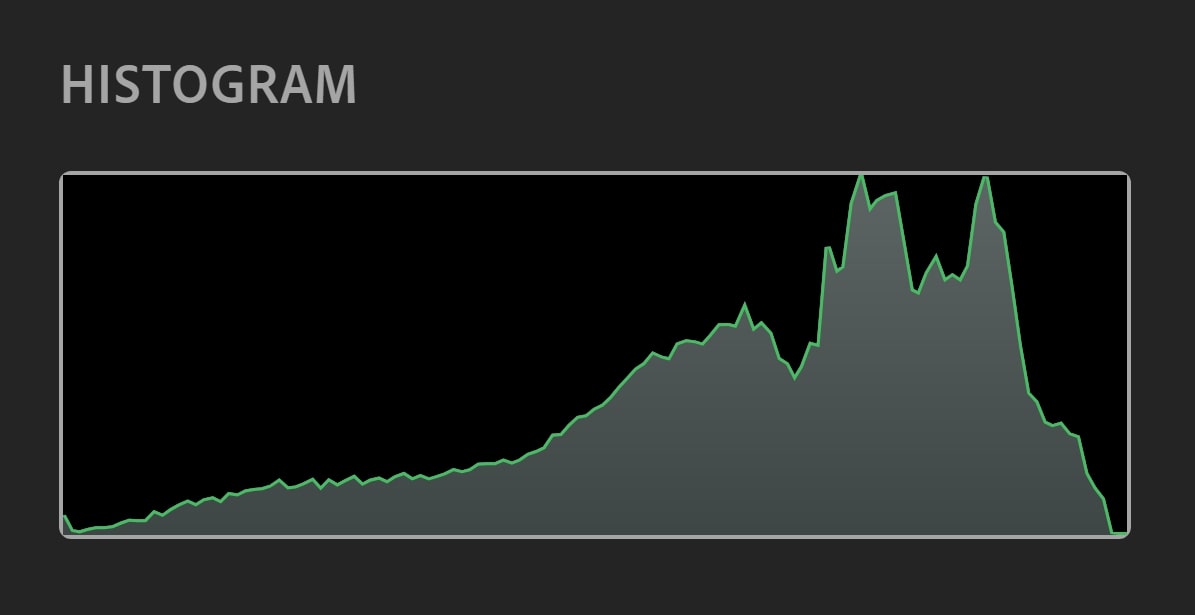
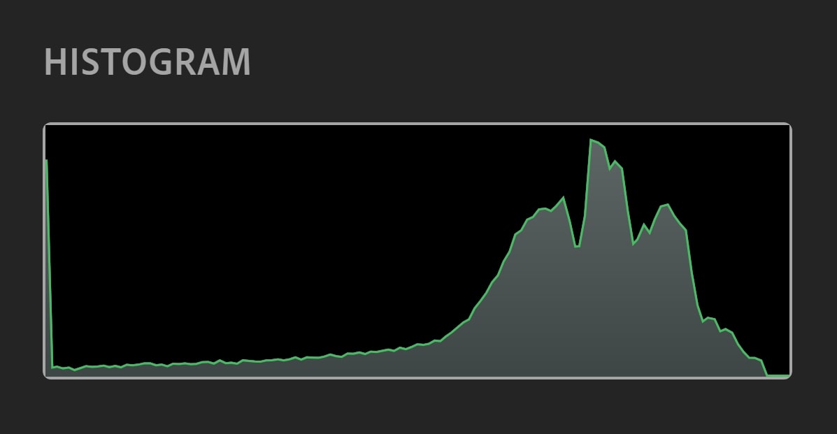
A “properly exposed” photo will produce a histogram reading with a graph that is spread across shadows, midtones, and highlights.
What a properly exposed photo’s histogram might look like. The reading shows a dynamic distribution of tones in the midtone section of the graph.
The aim of a proper exposure is to capture the light in your photograph the way you perceive it in real life – or at least what comes close to looking as realistic and natural as possible. This means capturing the full scope of tones found in your scene or subject. Photos that successfully do so generate a histogram similar to the one above.
A photo containing more blacks and shadows will have a graph that leans towards the left, while one with more whites and highlights will have a graph that leans towards the right.
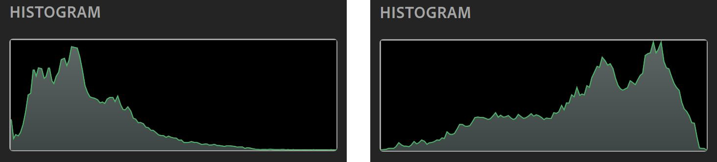
The histogram of a darker photo on the left, and a lighter photo on the right.
Interpreting Your Histogram
Compensating for Clipping
Now at this point you might be thinking, “How does any of that help me?” Good question!
There are actually a few different ways you can get information about your photo from the appearance of your histogram. The histogram’s most popular use is to determine whether or not your photo is over- or underexposed, and let you know how that affects the appearance of your photo.
Though your camera’s meter attempts to provide you with the best possible settings for a proper exposure, it occasionally makes mistakes (especially in automatic). These misreadings can result in overexposed or underexposed photos, which, while sometimes correctable if shot in RAW, is not exactly ideal.
The reason for this is that either extreme can result in a loss of detail in your photo, otherwise known as clipping. Clipping occurs when areas of your photo become too dark or too light for your camera’s sensor to register any detail. The result is usually a flat mass of black or white in your photo, and an inability to salvage any apparent details, even through editing. Think of it like your camera’s in-plain-view blindspot.
This is where luminance histograms shine.
A huge spike touching either the left or right end of your luminance histogram indicates clipping, and lets you know you’ve lost some details in your photo.
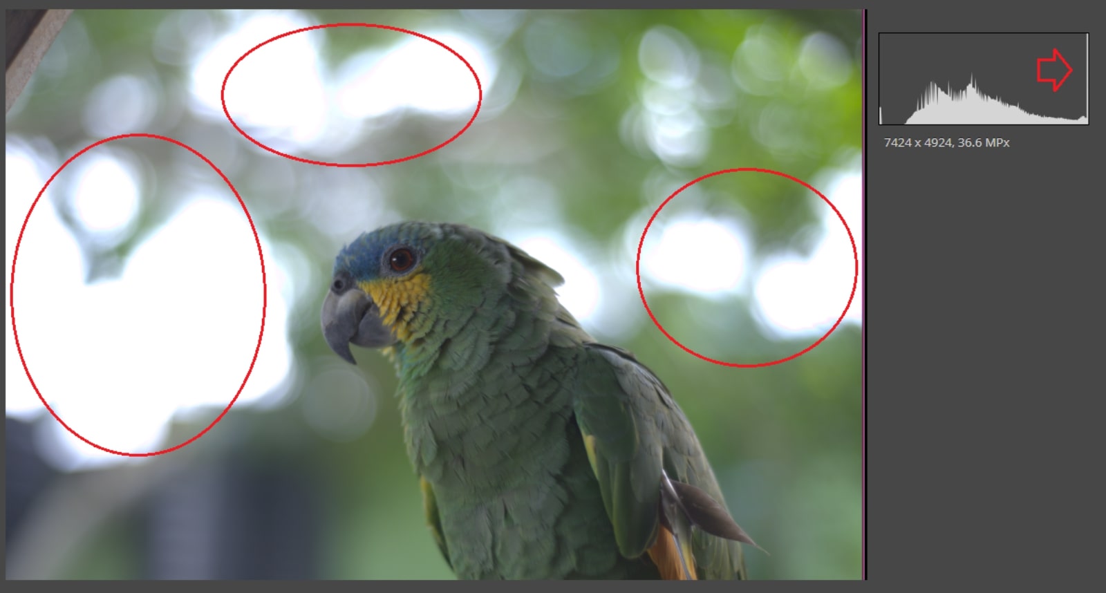
The highlights circled in the photo have caused a loss of detail, as indicated by the almost imperceptible, but very tall, portion of the graph that is touching the absolute right of the histogram.
If I have an overexposed photo with a severe amount of white light, my histogram will display a graph with a spike touching the rightmost portion of the histogram. The opposite would be true for an underexposed photo.
These histograms will also often be missing the information for blacks or whites, depending on if your photo is over- or underexposed.
So, for instance, in an underexposed photo, the photo might contain no information for whites or highlights. As a result, the graph would be completely absent from the left side of the histogram. The reverse is possible for overexposed photos.
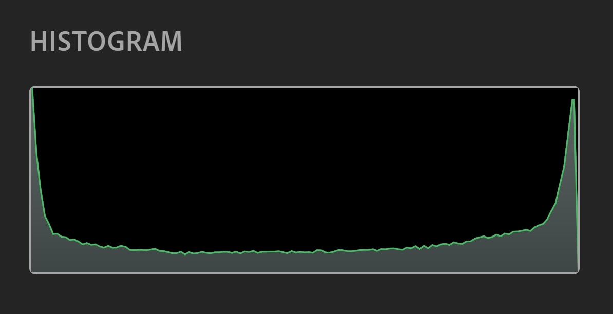
An underexposed photo with no whites or highlights. Notice how the graph touches the left edge of the histogram and lacks any information for the whites or highlights, leaving that right side of the graph empty.
An overexposed photo. Here, the graph touches the right edge of the histogram. Because of a lack of blacks or shadows, the graph does not extend to the left of the histogram.
In most cases, you photos will not be as radically over- or underexposed as the photos above. Nevertheless, if you notice a spike touching the edges of your histogram, you should make adjustments if you would like to achieve a more neutral exposure without missing details.
Ideally, you should take several different exposures of the scene or subject you’re trying to capture, checking your histogram after your first shot to validate your exposure settings. This will allow you to make adjustments with plenty of time to spare in the case of an incorrect exposure.
Should You Always Use Histograms to Correct Your Exposure?
Well, yes and no.
Just because a photo produces a histogram inclined towards a certain tone, that does not necessarily mean your photo has an incorrect exposure. The readings that matter to your photo’s details are whether a peak of your graph is completely touching the right or left end of your histogram. It is absolutely possible to have a correctly exposed photo that leans towards shadows or highlights.
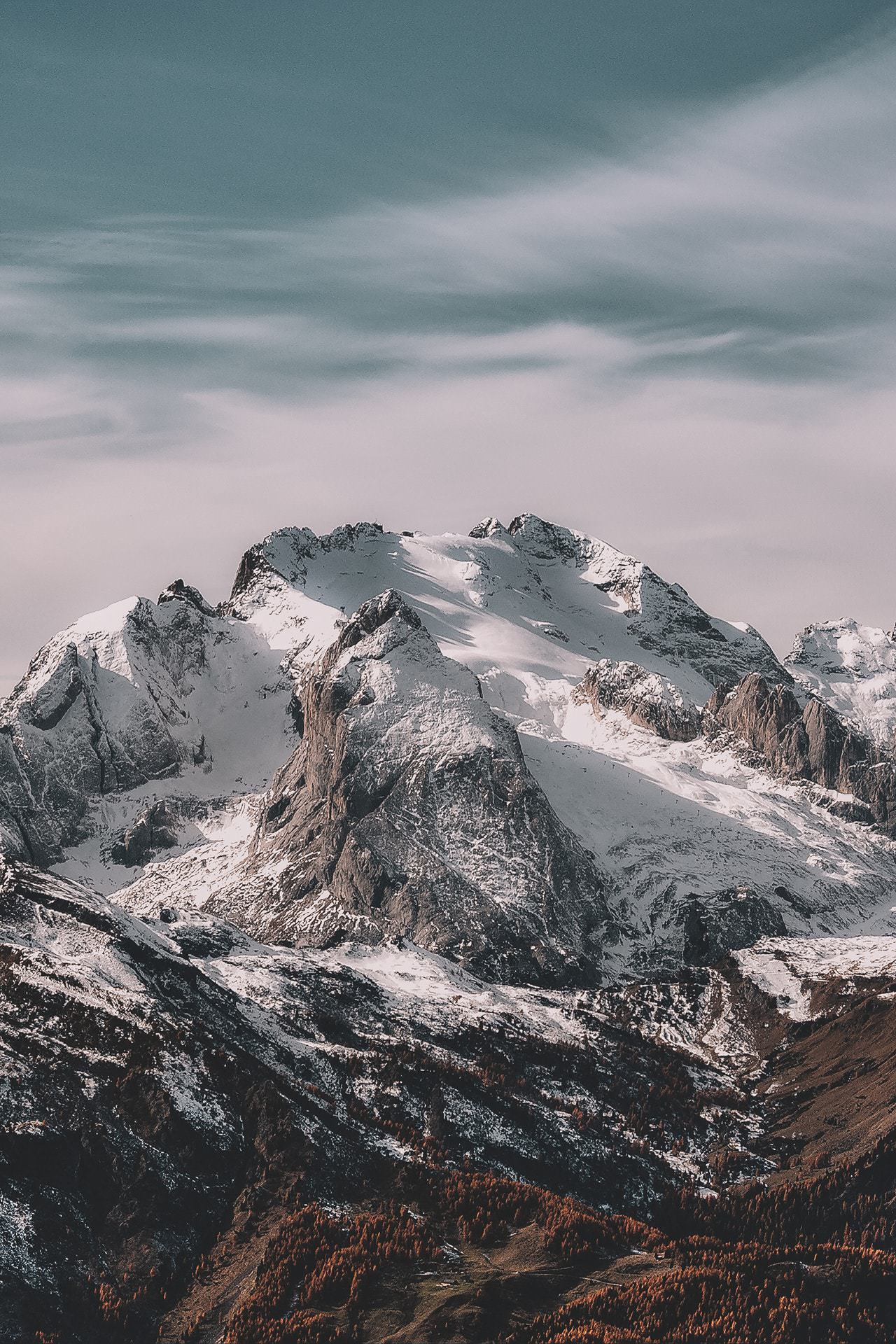
Photo by eberhard grossgasteiger from Pexels
Aside from all the technical mumbo jumbo, you can also stylistically choose to shoot a photo that breaks all the rules and disregards a histogram’s suggestions. Technicalities like proper exposures and their histograms should, within reason, be used at your discretion as an artist.
Take into context what kind of exposure best suits your subject. A landscape, for example, would probably benefit best from an exposure setting that produces a neutral histogram. A portrait, however, might be dramatized by a darker, or more highly contrasted exposure.
Your choices rely on your awareness of what mistakes can be made, both on the part of your camera’s meter and the histogram, and what aesthetic choices you have in mind.
This doesn’t, however, make your histogram obsolete. Histograms can go beyond just ensuring your photo is correctly exposed. In fact, it benefits you to know what else your histogram can tell you about your photo and when your photo might actually be the exception to the rule.
High Contrast Histogram
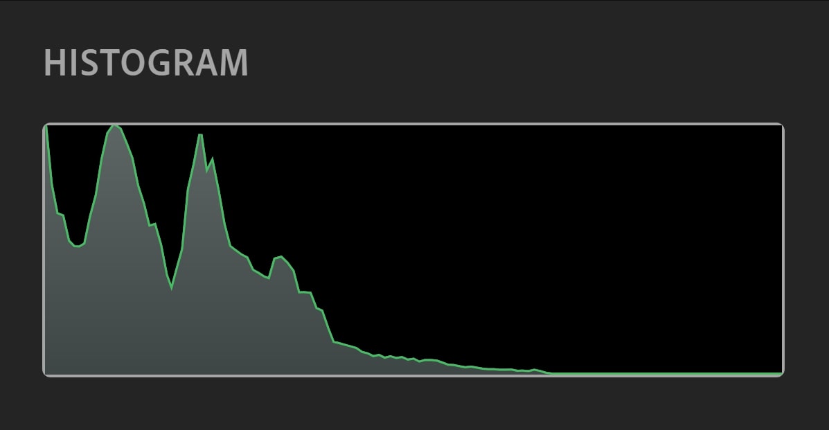
High contrast photos make use of plenty of strong black and white tones and fewer midtones. They risk losing details for what may be a more impactful photo.
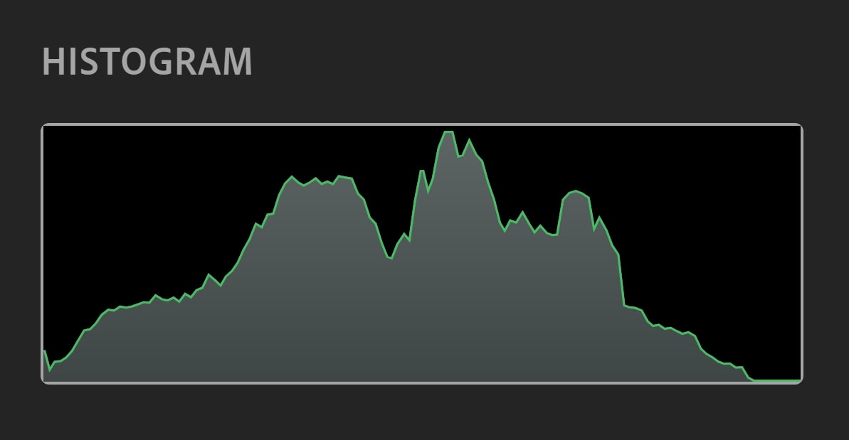
Histograms for a high contrast photo will have strong, peaked readings for dark and light tones, and lower readings for the middle grays. The shape can almost be comparable to a ‘U’.
This kind of histogram reading doesn’t mean your photo is bad! High contrast is often used in photography to add a dramatic mood to photos, and is very popular in the genre of black and white photography.
While most editing programs will allow you to artificially bump up the contrast of your photo, it’s completely possible to shoot with high contrast in mind. Scenes with harsh shadows and lights, or sharply differing color contrasts can all produce high contrast photos straight from your camera.

A high contrast histogram generated by the harsh amounts of blacks, shadows, whites, and highlights in this photo – no editing required.
If that happens to be your goal when shooting, keep in mind that, while the appearance of your histogram might correctly suggest the loss of detail, you’re actually looking to generate a histogram with more blacks and whites than midtones.
Low Key Histogram
Low key photography is very similar to high contrast photography in that low key photos often add a more dramatic mood to your pictures. Low key scenes are shot with a generous amount of darks and blacks and a reduction to highlights and whites. This doesn’t mean that whites can’t or shouldn’t appear in your photo, simply that dark tones are far more common. The graph for these photos will be inclined to the left of your histogram, with a heavier emphasis on dark tones and midtones.
Low key photos can also be artificially created through editing, or produced straight from your DSLR with the use of either natural or studio lighting.
Since the histogram won’t match a proper exposure’s one, it’s on your judgement to decide whether you’ve taken an adequate photo or not.
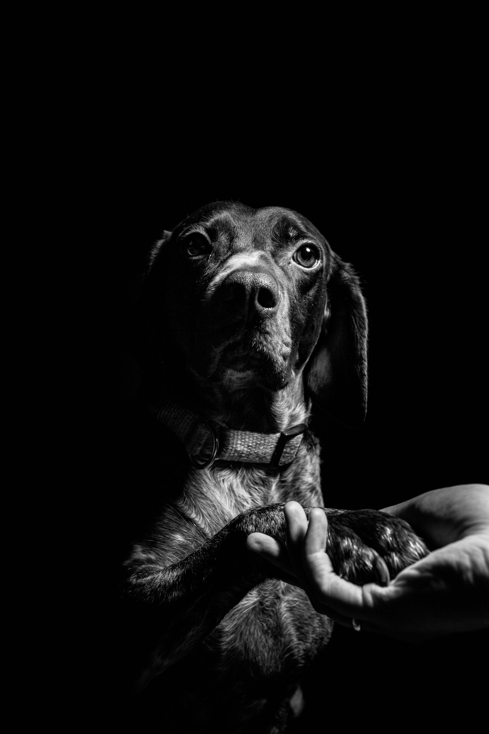
Photo by Fabian Gieske on Unsplash
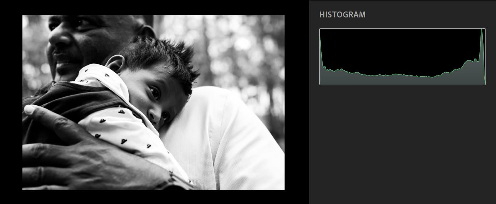
Low key photos may also produce a graph that touches the left of your histogram.
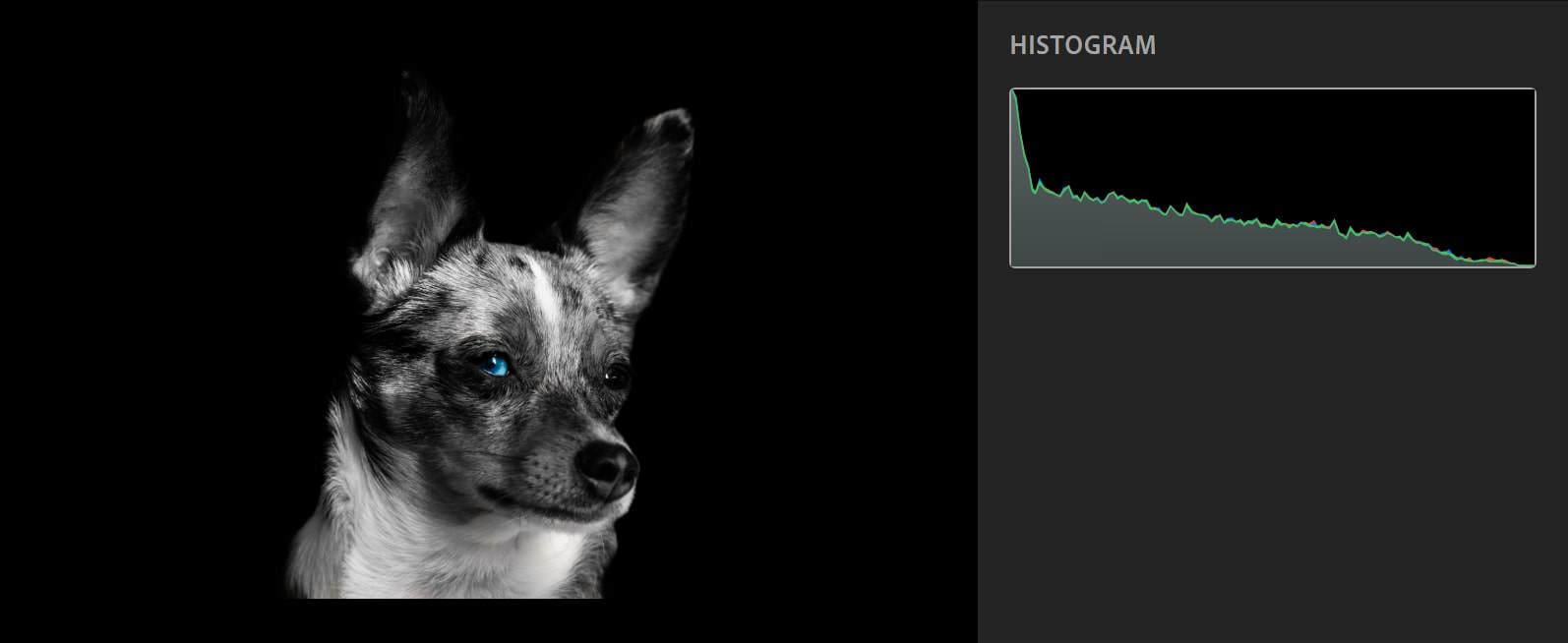
In the example above, the portrait of the dog has a completely flat black background, with no perceptible details. As a result, the portrait registers as having lost detail and generates a histogram with a graph that touches the leftmost point of the histogram.
As with the example of high contrast histograms, this doesn’t exactly mean that this particular photo is underexposed, just that there are black, plain tones found within the photo. Because low key photos involve a heavy amount of dark tones, it is acceptable for your low key graph to touch the left of your histogram.
High Key Histogram
Just as you’d expect, a high key exposure is the opposite of a low key exposure, reducing the shadows and blacks of a scene, and instead focusing on highlights and whites. Like low key photos, high key scenes can continue to utilize smaller amounts of dark tones. The graph of a high key photo will be shifted to the right of your histogram.

Example Photo by eberhard grossgasteiger from Pexels
High key photos can also contain informationless white tones that are a perfectly normal, acceptable part of the photo.
Photo by Maria Teneva on Unsplash
Also like low key photos, high key photos can be used to convey moods, most popularly, happiness. Even in the photo above, the lighter tones contribute to an airy and relaxed vibe. It’s a good example of how context affects your photo and your stylistic choices. Context is a key aspect of how you choose to shoot your photo, interpret your histogram, and make further edits.
You can create high key photos through natural lighting, studio lighting, and/or an editing program. Again, it is up to you to evaluate your subject, determine if it is in fact a high key scene, and make adjustments to produce an accurate photo.
RGB Histograms

Now that you understand how to read histograms and what the shapes of certain graphs might mean, let’s take a step back and look at RGB histograms.
Histograms that deal with the specific color channels that are involved in generating the colors of your photo are referred to as RGB histograms, which represent red, green, and blue – the three primary colors used to produce all the colors that can be found in your photo.
Like luminance histograms, RGB histograms display brightness from darks to lights, with dark tones on the right and light tones on the left. They also run from a value of 0 on the left to 255 on the right, with 0 being the absence or lowest brightness of that color and 255 being the greatest saturation or highest brightness of that color.
The difference here is, rather than dealing with all the color channels grouped together and represented in a condensed white/black graph from blacks to whites, we’re looking at the varying brightness intensities of a single color.
Believe it or not, specific colors can become under- or overexposed. And unfortunately, that’s not something you can measure with your default luminance histogram, making RGB histograms all the more useful.
Just like with a regular histogram, on an RGB histogram you’re going to be on the lookout for graphs that touch either the right or left extreme of you histogram to indicate a loss of detail in that particular color.
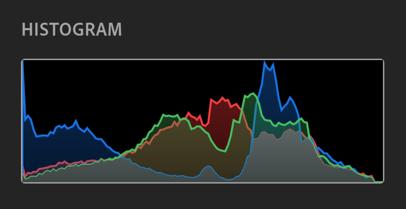
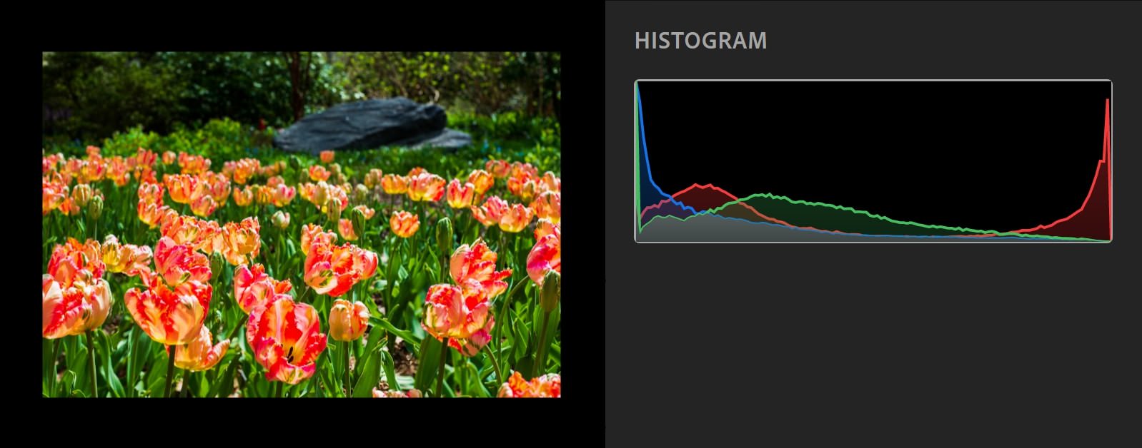
The histograms for the different channels may appear similar or different depending on the colors found in your photo. This means that you cannot rely on the information found in one color’s histogram to convey the information you’d find on another color’s. For example, a red histogram with a graph that touches the right end does not necessarily mean that either the blue or green graphs also touch the right ends of their respective histograms. Or, you might have a situation like in the example above, where all generated graphs are relatively similar to each other.
Color Histogram
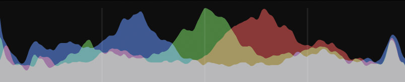
I’ll admit, the distinction some people present for color histograms from RGB histograms can be pretty fuzzy. Some people call RGB histograms color histograms, while other people refer to them as completely different graphs.
That being said, it’s been my experience that editing programs will occasionally use the term color histogram to refer to the display of all three RGB histograms on one graph, while keeping each channel distinctly coded with their respective color and simultaneously showing the overlap between colors.
As we’ve gone over, these three primary channels mix together at varying intensities to create the colors you see in your photo. All colors mixed together at an equal intensity for the same value produces either the color black or white. If I were to take a photo and push all three channels up to a value of 255, my photo would turn completely white. If I were to do the opposite and push down all three channels to zero, my photo would instead turn completely black.
Similarly, two colors out of the three can mix at the same intensity to produce either cyan (green + blue), magenta (red + blue), or yellow (green + red).

The color histogram shows you the intersection of your RGB histograms. From it, you can see how all three colors interact to produce other colors (cyan, magenta, yellow, and a gray graph that represents whites and blacks) and the distribution of brightness for those colors.
Whew, That Was a Lot!
It turns out that, not only are histograms relatively easy to read, but they also contain plenty of information that can further your understanding of your photography. Using the information above can change both the ways you shoot and edit your photo. While I’d definitely call histograms more of a guide than a rule, they are a valuable method to keeping your exposures accurate when you need to and helping you determine a stylistic shooting or editing choice if you’d like to.
If this still all seems a bit overwhelming, my suggestion would be to go over some of the key points from this article and then put them to practice. Familiarize yourself with your histogram and toy with the ways the brightness of your exposure affects your reading. I guarantee you, there is no better way to understand something in photography than to utilize it. And even if you’re already feeling confident, it doesn’t hurt to put your newfound knowledge to the test.
Remember: In photography, practice makes perfect!