

download sample images
Download Assets
Downloads are free with a PHLEARN account.
- Download the sample images and PSDs from every free tutorial on PHLEARN
- New free tutorials published every week
- One free account — sign up once, then download anything
Watch the Full Series
description
2020 Edition
This lesson is from the original 30 Days of Photoshop. Photoshop has changed a great deal since — there is an updated version of this lesson in the 2025 Edition: Adjustment Layers in Photoshop, Day 5.
From exposure adjustments, to color grading, to creating seamless composite images, Adjustment Layers can help us tackle a lot. Learn about the different types of Adjustment Layers and how to use them to enhance a photo.
This is Day 4 of our 30 Days of Photoshop series. If you enjoyed it, follow along with all 30 episodes as we explore the the magic of Photoshop together!
Continue Watching 30 Days of Photoshop
Enjoying This Free Tutorial?
We publish a new free tutorial every week, each one with sample images and PSDs you can download and follow along with. Sign up and they land straight in your inbox, along with early word on sales, events and subscriber-only offers.
Non-Destructive Editing
An adjustment layer changes how an image looks without changing the image. The original pixels are never touched — the adjustment sits above them as its own layer, and you can switch it off, fade it back, mask it into one corner of the frame, or reopen it a year later and change your mind. That is the whole idea, and it is why almost every serious Photoshop edit is built out of them.
This lesson goes through the full list, from the ones you will reach for daily to the ones you will use twice a year, and builds up a heavily coloured version of one portrait by stacking them.
Three Ways to Add One
Use whichever fits your habits. Layer > New Adjustment Layer gives you the full named list. Window > Adjustments gives you the same set as icons. And the half-dark circle icon at the bottom of the Layers panel gives you the list plus the fill layers — Solid Color, Gradient and Pattern — at the top.
Whichever route you take, the result is identical: a new layer with its own properties and its own layer mask, sitting above whatever was selected.
The Two Controls Every Adjustment Layer Shares
Opacity
If an adjustment is right in character but too strong, do not redo it — drop the layer’s opacity. Half strength is one drag away, and it works on every adjustment in the list.
The Layer Mask
Every adjustment layer arrives with a white mask, meaning it applies everywhere. Press Ctrl/Cmd + I to invert it to black and the adjustment vanishes completely. Now paint white with a soft brush at low opacity, and it appears only where you brush. Paint black to take it back out. White reveals, black hides — the same rule as any other mask.
That invert-then-paint move is the single most useful habit in this lesson, and it is how nearly every adjustment below gets confined to the part of the photo that needed it.
Brightness/Contrast
The simplest of the exposure adjustments, and the one to use when a photo needs nothing more complicated. Two sliders, plus an Auto button that reads the image and proposes a starting point — which is often better than expected.
It is not used heavily in practice, because Levels and Curves do the same job with far more control.
Levels and Curves
Levels gives you three controls: a black point (everything to its left becomes black), a white point (everything to its right becomes white), and a midpoint that lightens or darkens the middle values. Pull the midpoint down and detail appears in a bright sky.
Curves does the same job in a different shape, and both let you work on individual colour channels. Switch to the Red channel and you add or remove red; same for Green and Blue. Adding blue to a sky through the Curves blue channel, then inverting the mask and painting it in, gets you a deeper sky in about fifteen seconds.
Both get a lesson of their own in Classic Day 6.
Vibrance
Vibrance holds two sliders and the difference between them matters. Saturation increases every colour equally. Vibrance increases the muted colours and deliberately protects skin tones.
The rule that follows is simple: if there is a person in the frame, use Vibrance, not Saturation. Push Saturation on a portrait and the reds and skin tones go unnatural almost immediately.
Hue/Saturation for Changing One Colour
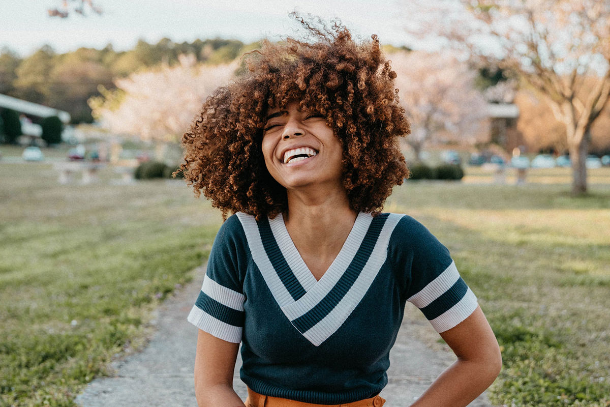
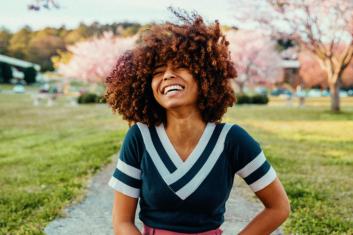
This is the adjustment that does the heavy lifting in the demonstration, recolouring the subject’s trousers from orange to magenta.
-
Switch From Master to a Colour Range
The dropdown defaults to Master, which affects everything. Change it to the family you want — Yellows, Reds, Greens.
-
Sample the Actual Colour
Click the eyedropper and click the thing you want to change. The range narrows to that specific colour rather than the whole family.
-
Move Hue, Saturation and Lightness
Shift the hue until the colour is where you want it. It will still be affecting more of the image than you intended — that is expected.
-
Invert the Mask and Paint It Back In
Ctrl/Cmd + I, then paint white only over the object. Skin is often close in hue to warm clothing, so the mask is what keeps the change off your subject.
-
Fix Overspill With X
Painted onto skin by mistake? Press X to swap to black and paint it out. No undo needed, and no limit on how many times you go back and forth.
Stack several of these — one for the trousers, one for the background, one for the greens — and each stays independently editable.
Colour Balance and Photo Filter
Color Balance lets you push colour separately into the shadows, midtones and highlights. Cool shadows with warm highlights gives you a duotone look in two moves — usually worth backing off to around 50% opacity.
Photo Filter is the quickest of all: a set of ready-made warming and cooling filters with a density slider, plus a few stronger colour options. One click and a density tweak.
Black & White
It converts to greyscale, but the reason to use it over a saturation drop is the per-colour sliders. You control how light or dark each original colour renders in the black and white — darken the greens, lighten the cyans — which is real tonal control rather than a flat conversion. Lower its opacity for a partly desaturated look.
The Occasional Ones
Channel Mixer
Shifts how much of one colour channel feeds into another. Powerful and genuinely hard to control — more of a special-effects tool than part of a normal workflow.
Color Lookup
Loads LUTs, which apply a complete pre-built look in one click. Photoshop ships with a set. Useful if you want a consistent look across a batch rather than colouring each image by hand.
Invert, Posterize and Threshold
Invert flips the image to a negative. Posterize reduces the number of tonal levels. Threshold forces everything to pure black or pure white at a point you choose — handy for graphics, and genuinely useful for checking tonal separation while compositing.
Gradient Map
Maps a gradient across the tonal range of the image. At full strength the result is wild; drop the opacity right down and it becomes one of the better colour-toning tools in Photoshop. Classic Day 20 uses this for colour grading.
Selective Color
Adjusts the cyan, magenta, yellow and black content of one colour family at a time. The effect is subtle by design, which makes it the right tool for small skin-tone corrections.
Group Them When You Are Done
After a dozen adjustments the Layers panel is unreadable. Shift-click the whole stack and press Ctrl/Cmd + G, then name the group.
This buys you something better than tidiness: lower the group’s opacity and you fade the entire edit at once, landing halfway between the original and the fully processed version. On a heavily coloured image that is often exactly where the believable result lives.
Stack Your Own
Download the sample image and PSD and build the stack yourself. Start with Levels for the sky, add Curves on the blue channel, Vibrance for the colour, then two or three Hue/Saturation layers masked onto individual objects. Toggle each one to see what it contributed, then group the lot and pull the group opacity to 50%.
Tomorrow, Classic Day 5 covers selections, which is how you target an adjustment without painting the mask by hand. For the current version of this lesson, see Day 5 of the 2025 Edition.
Related Tutorials


Enjoying This Free Tutorial? Go Further with PRO.
200+ PRO courses. 1,000+ practice files. One membership.

Unlimited access to every PRO course
New PRO courses every month
Layered PSDs and RAW files to follow along
100+ Lightroom Presets, LUTs, Actions and Brushes
Stream in up to 4K, with captions and chapters
Watch on any device: desktop, tablet or phone
4.93 average from 3,900+ reviews · 2M+ students