

Download Sample Images
description
Photo editing is the most fun and satisfying part of the post-production workflow, but where do you start? Follow along as we break down all of the editing tools in Lightroom Classic that will help you fix exposure, recover detail, correct colors, color tone, and more!
If you’re ready to take a deep-dive into everything Lightroom Classic has to offer, try our PRO tutorial The Beginner’s Guide to Lightroom Classic!
Enjoying This Free Tutorial?
We publish a new free tutorial every week, each one with sample images and PSDs you can download and follow along with. Sign up and they land straight in your inbox, along with early word on sales, events and subscriber-only offers.
Free Lightroom Preset Sample 10 Pack
Lightroom Presets are a great way to quickly add style and charm to your photos. Try our custom-made PHLEARN Lightroom Presets with our free sample 10 pack of some our favorite bright and beautiful looks!
Watch Next
This episode is part of our FREE Intro to Lightroom Classic series.


LEARN TO USE LIGHTROOM CLASSIC
Editing in Lightroom Is Just Sliders, Pulled in the Right Order
This is part three of our free Intro to Lightroom Classic series. In the first two videos we covered importing and organizing your photos and then culling down to your favorites. If your catalog already has stars and color labels on it, you’re in exactly the right place.
Now the fun part. Lightroom’s Develop module can look intimidating the first time you scroll it — there are a lot of panels — but almost all of the work is done by a handful of sliders, and there’s a sensible order to pull them in. Learn that order and you can take a flat, dark, slightly grey photograph to something you’d actually print, in about two minutes.
Filtering Down to Your Keepers
There’s no point editing photos you’ve already rejected, so start by hiding them.
-
Show the Library Filter bar
If you can’t see it above the grid, go to View and make sure Show Filter Bar is checked.
-
Click Attribute
This is where the star ratings, flags and color labels you applied during culling live.
-
Filter to your final picks
Select the color labels you used for your keepers — red and yellow in this example. The grid collapses to just those images.
-
Open one in the Develop module
Double-click an image, then click Develop in the top-right module picker. Editing starts here.
Getting Around the Develop Module
Before touching a single slider, it’s worth knowing what’s where, because two of these panels are the reason Lightroom is so forgiving to learn in.
The right column is where you edit
Every editing tool lives here, stacked top to bottom in a deliberate order: histogram, then the basic tone and color sliders, then Tone Curve, HSL/Color, Split Toning, Detail, Lens Corrections, Transform and Calibration. Working top to bottom is a genuinely good default.
The left column is your safety net
Presets, Snapshots and History sit over here. History records every single adjustment you make, and you can click any point in that list to jump back to how the image looked at that moment. If a cat walks across your keyboard mid-edit, this is the panel that saves you. There’s also a Reset button at the bottom right that returns the photo to its imported state. Nothing you do in the Develop module is permanent.
At the top of the right column is the histogram — dark tones plotted on the left, bright tones on the right. Ideally nothing is jammed hard against either end, because that means detail has been clipped away to pure black or pure white. Click the small triangle in the top-right corner to turn on the highlight clipping warning, and any blown-out areas overlay in red. That red is your first instruction: pull the Highlights slider down until it disappears.
Setting Your White Balance
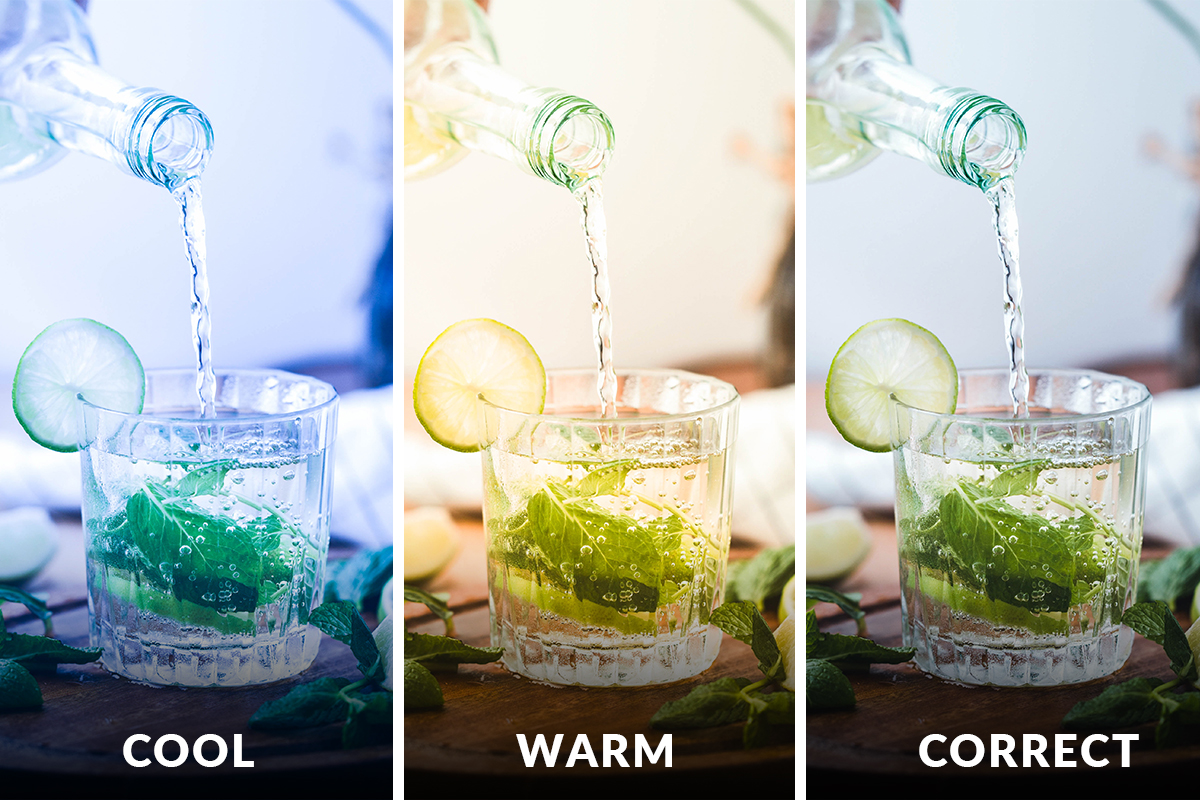
White balance sets the overall color cast of the image, and getting it right first makes every color decision after it easier.
-
Try a preset first, if you shot RAW
The dropdown offers As Shot, Auto, Daylight, Cloudy, Shade and so on. Those named presets only appear on RAW files — a JPEG gives you As Shot, Auto and Custom.
-
Use the eyedropper on a neutral target
Click the eyedropper and then click something in the frame that should be neutral grey. This is exceptional if you photographed a grey card; if there’s nothing genuinely neutral in the shot, skip it rather than guessing.
-
Or just use the two sliders
Temp runs blue to yellow, Tint runs green to magenta. Dragging by eye is completely legitimate, and often faster than hunting for a neutral.
The Tone Sliders: Where Most of the Work Happens
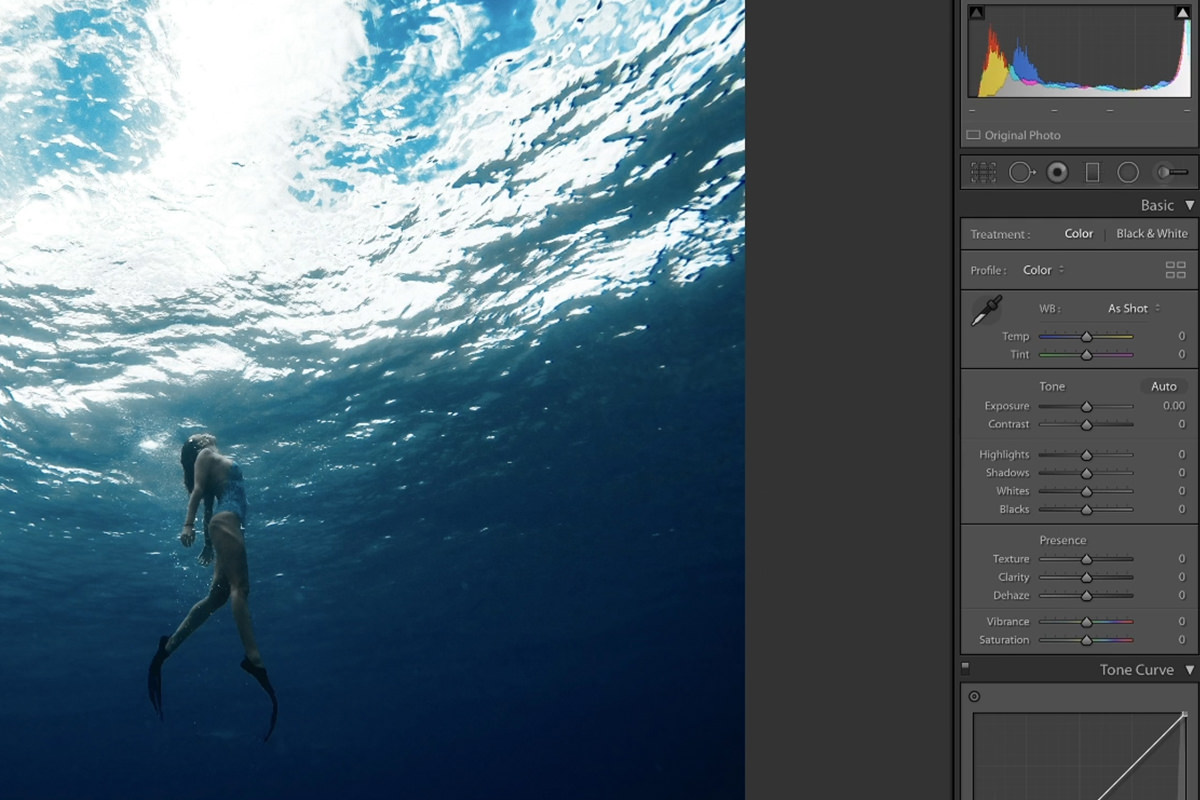
This block — Exposure, Contrast, Highlights, Shadows, Whites, Blacks — will do 80% of the work on most photographs. The order matters more than people expect.
-
Recover the highlights first
With the clipping warning on, drag Highlights to the left until the red overlay clears. You’re pulling back detail that’s still in the file but not currently visible.
-
Lift the shadows before you touch Exposure
This is the habit worth building. If a photo looks dark, the instinct is to raise Exposure — but that brightens everything, including highlights you just rescued. Raising Shadows instead opens up the dark areas and leaves the bright ones alone. That separation is a big part of what makes Lightroom powerful.
-
Set the white and black points
Whites and Blacks define the two ends of the tonal range. Pulling Whites left can recover a little more highlight detail; pushing Blacks left gives you a properly deep black instead of a washed-out grey.
-
Now adjust Exposure and Contrast
With the extremes handled, use Exposure for overall brightness and Contrast to set how punchy the image reads. You’ll usually need far less of both than you would have at the start.
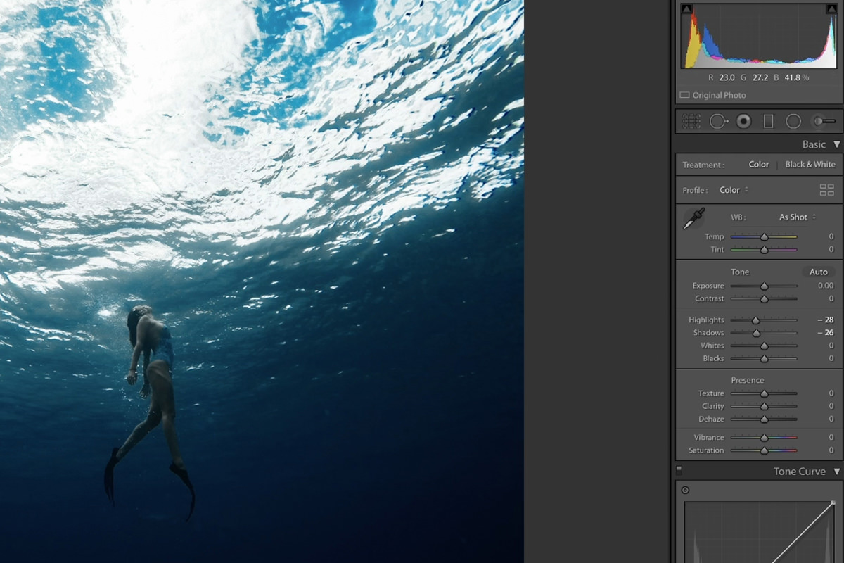
Every one of these responds to a click-and-drag, or you can double-click the number and type an exact value. And if you’re editing a RAW file rather than a JPEG, all of them have considerably more room to move before the image starts to fall apart — the same latitude you get in Adobe Camera Raw.
Presence: Texture, Clarity, Vibrance and Saturation
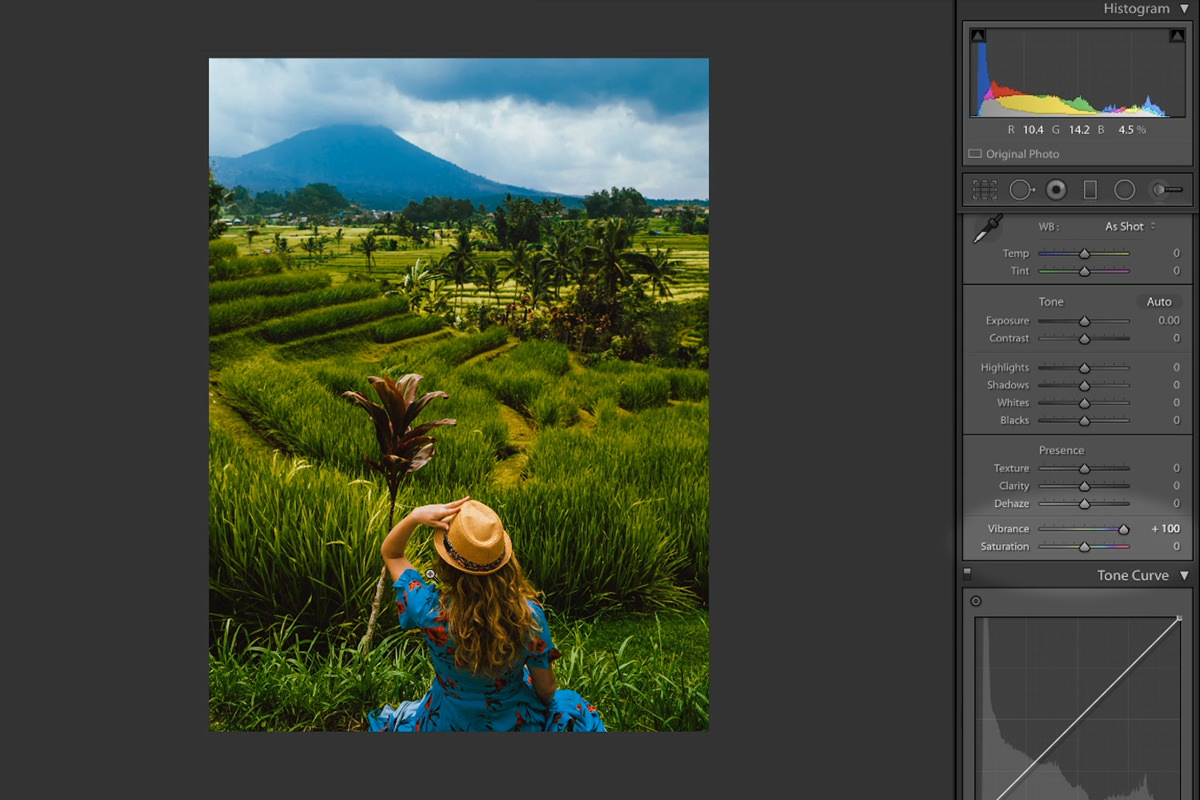
Texture, Clarity and Dehaze
Texture and Clarity do a similar job at different scales. Texture works on fine detail — skin, fabric, foliage — while Clarity works on larger midtone contrast across bigger shapes. Zoom in to judge Texture and zoom out to judge Clarity, or you’ll misread both. Dehaze cuts through atmospheric haze, and pushed negative it will happily add fog if that’s the look you’re after.
Vibrance versus Saturation
These are not the same slider with different names. Saturation boosts every color in the frame equally. Vibrance boosts the least-saturated colors hardest and deliberately protects skin tones. Push Saturation to 100 on a portrait and skin goes orange; push Vibrance to 100 on the same shot and the scene gets richer while the person still looks like a person. If there are people in the photograph, reach for Vibrance.
Going Further: Curve, Color and Toning
The Tone Curve
Functionally this is the same tool as Curves in Photoshop. Drag the lower part of the line up to lift shadows, pull the upper part down to soften highlights — that’s a classic faded-film contrast reduction in two moves. Click the small point-curve icon at the bottom right of the panel and you also get access to the individual Red, Green and Blue channels, which is how you build duotones and split-channel color grades by hand.
HSL and Color
The HSL panel targets individual color ranges rather than the whole image, across three tabs: Hue shifts a color to a different color, Saturation makes it richer or greyer, and Luminance makes it lighter or darker.
The fastest way to use it is the small target icon in the corner of each tab. Click it, then click and drag directly on the part of the photo you want to change — Lightroom works out which sliders to move. Drag down on a blue sky under Luminance and it deepens; drag up on foliage under Saturation and it greens up. Just remember it’s targeting a color range, not an object, so anything else in the frame sharing that color moves too.
Split Toning
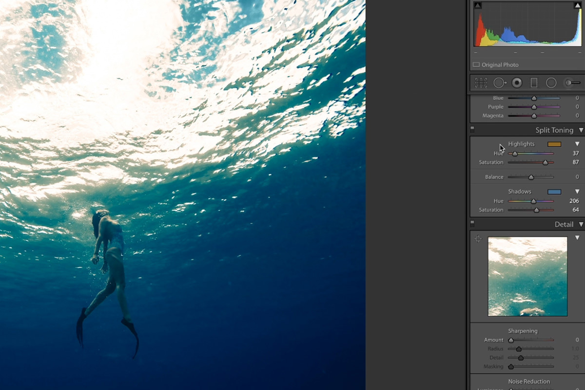
Split Toning puts one color into the highlights and a different one into the shadows — warm highlights against cool shadows is the classic cinematic combination. Raise the Saturation slider first so you can actually see what the Hue slider is doing, then dial the saturation back down to taste. Treat this as color grading rather than correction, and save it for after your basic edit is finished.
Sharpening, Noise and Lens Corrections
The last two panels are cleanup rather than creative work, and both benefit from a light hand.
-
Zoom to 100% before sharpening anything
Sharpening is invisible at fit-to-screen and misleading at 200%. Use the small preview window in the Detail panel to park it on the most important area — usually a face.
-
Set Amount and Radius conservatively
Amount is how much, Radius is how large the details being sharpened are. A small radius targets fine texture like pores; a larger one works on broader shapes.
-
Use Masking to protect skin
Hold Alt or Option while dragging Masking and the preview turns black and white — white areas get sharpened, black areas are protected. Push it until only genuine edges stay white and smooth skin goes black.
-
Reduce noise if you need to
Below sharpening, Luminance smooths grain and Color removes the colored speckle you get from high ISO. Both soften the image, so use the minimum that works.
-
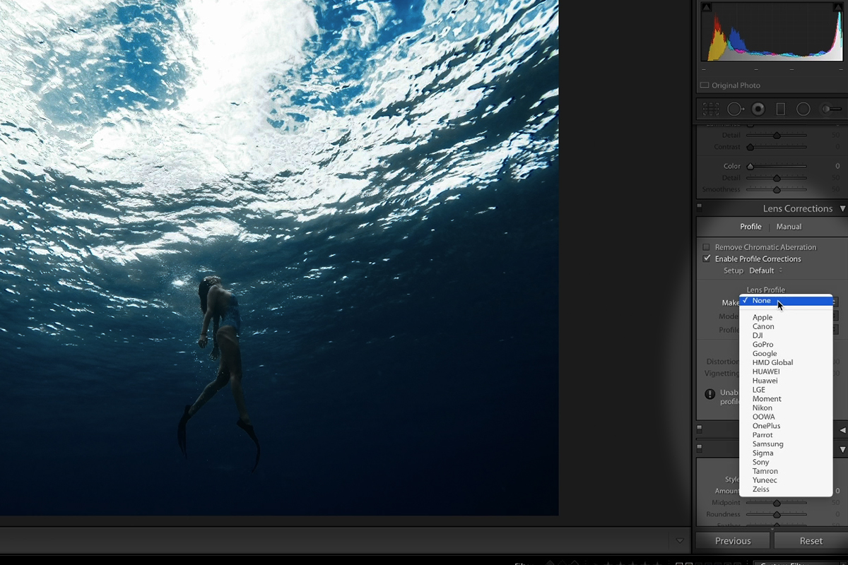
Enable Profile Corrections
Lightroom reads the camera and lens from the file’s metadata and corrects that lens’s known distortion and vignetting automatically. If you shot the photo yourself, turn this on every time. Stock images often carry no usable metadata, in which case correct distortion and vignetting manually.
Further down, the post-crop vignette under Effects is the one to use for a deliberate darkened or lightened edge, because it recalculates after you crop. Adjust Midpoint, Roundness and especially Feather until the transition is invisible — a vignette you can see the edge of always reads as an effect. Transform is there for straightening architecture, and Calibration is best left alone; modern camera profiles are accurate enough that it almost never needs touching.
Two Edits from Start to Finish
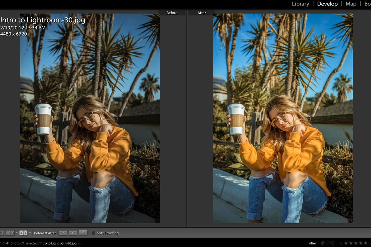
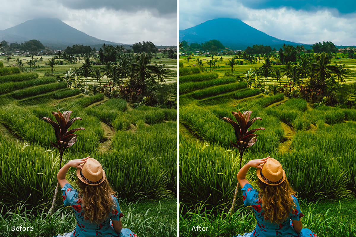
Here’s the whole sequence applied to a real image. Turn the highlight warning on, cool the Temp slider down and add a touch of green through Tint, then pull Highlights down until the red overlay clears. Add Texture and Clarity, lift Vibrance, and finish with a subtle post-crop vignette. Press Y for the side-by-side before and after view and the difference is dramatic — and none of it took more than a couple of minutes.
On a second image the priorities shift: shadows that are too dark, so a small Exposure lift and a Shadows increase, Vibrance up to bring out blues and yellows, then Highlights pulled back down where the subject’s face started to get hot. A little Texture and Clarity, careful sharpening with Masking on, and a Saturation nudge on the blues through HSL. Partway through, comparing against the before revealed the Clarity was overcooked — so it came back down. That kind of second-guessing is free here, which is the point.
Worth knowing: none of this has changed the file on your hard drive. Lightroom stores your edits as instructions in its catalog and shows you the result. To get an actual edited image out, you have to export one — covered later in this series.
Where People Get Stuck
Reaching for Exposure first
It’s the most obvious slider and usually the wrong starting point. Fix the highlights, then the shadows, then set your white and black points — Exposure is a finishing adjustment, not an opening one.
Judging sharpening at the wrong zoom
At fit-to-screen you’ll under-sharpen; at 200% you’ll wildly over-sharpen. 100% is the only honest view, and Masking is not optional on portraits.
Using Saturation on people
Vibrance exists precisely because Saturation wrecks skin tones. If there’s a person in the frame, that’s the slider to use.
Grading before correcting
Split Toning and HSL are much easier to judge once exposure and white balance are already right. Do the correction first, every time.
Continue the Intro to Lightroom Classic Series
This series runs start to finish, and each part builds on the last:
- How to Import & Organize Photos in Lightroom Classic — getting your photos in and building a catalog that stays findable.
- How to Filter & Favorite Images in Lightroom Classic — culling a shoot down to the frames worth editing.
- Advanced Photo Editing in Lightroom Classic — local adjustments, so you can edit one part of a photo without affecting the rest.
- How to Batch Edit Photos in Lightroom Classic — applying one edit across an entire shoot.
- How to Create Presets in Lightroom Classic — saving a look you like so it’s one click next time.
- How to Export Photos in Lightroom Classic — export presets, sizing for the web, and watermarked client proofs.
Build the Order Into Your Habits
The sliders themselves are easy. What separates a quick, confident edit from twenty minutes of going in circles is the sequence: highlights, shadows, whites and blacks, then exposure and contrast, then color, then cleanup. Run that order on the next twenty photos you edit and it stops being a checklist and starts being reflex.
And because Lightroom never touches your original file, there is genuinely no way to break anything. Pull the sliders to their extremes to see what each one does, then hit Reset and start again — that’s the fastest way to learn what all of this actually looks like on your own photographs.





Enjoying This Free Tutorial? Go Further with PRO.
Unlock Full Sample Files, PSDs, and Hundreds of Masterclasses!

Download full project assets, original PSDs, and RAW images for every lesson
Unlimited access to our complete library of PRO Photoshop & Lightroom courses
Instant 4K Ultra HD streaming on all devices, anytime, anywhere
Full access to our entire library of Photoshop Actions, Presets, and LUTs
Flexible monthly and annual membership plans
Cancel anytime with zero hassle or commitments