
Download Assets
Download Assets
This tutorial includes 1 sample RAW file. Downloads are free with a PHLEARN account.
- Free sample files with every tutorial on PHLEARN
- New tutorials published every week
- Unlimited downloads with your free PHLEARN account
Watch the Full Series
description
Editing portraits has one job: make the viewer look at the face. Almost everything worth doing serves that, and none of it should be dramatic.
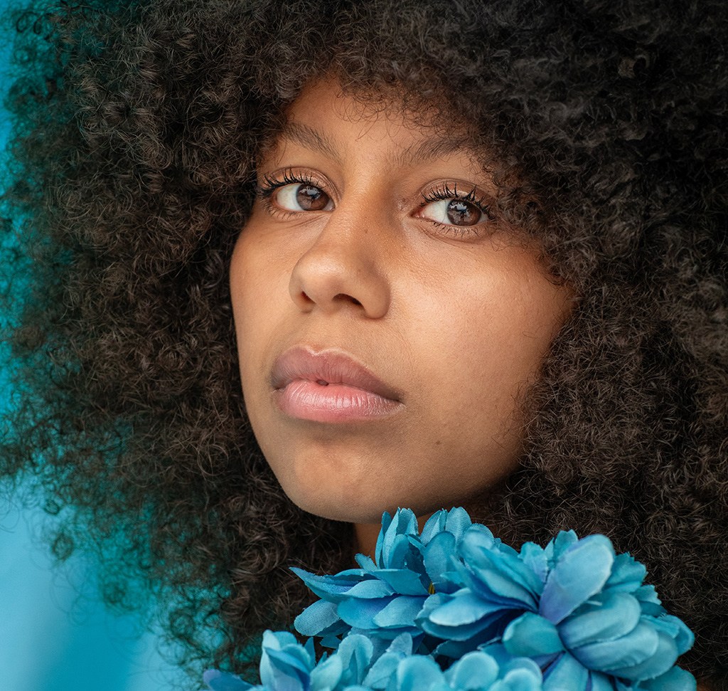
On Day 15 of 30 Days of Lightroom Classic we invert a subject mask to calm the background, brighten the face with paired radial gradients, enhance the eyes with a brush, and clean up skin.
This is Day 15 of our 30 Days of Lightroom Classic series. Follow along with all 30 episodes as we explore the magic of Lightroom together!
Continue Watching 30 Days of Lightroom Classic
JOIN 30 DAYS OF LIGHTROOM (FOR FREE!)
Ready to jump in? Sign up and we’ll email you a printable calendar and daily class schedule so you can get started right away!
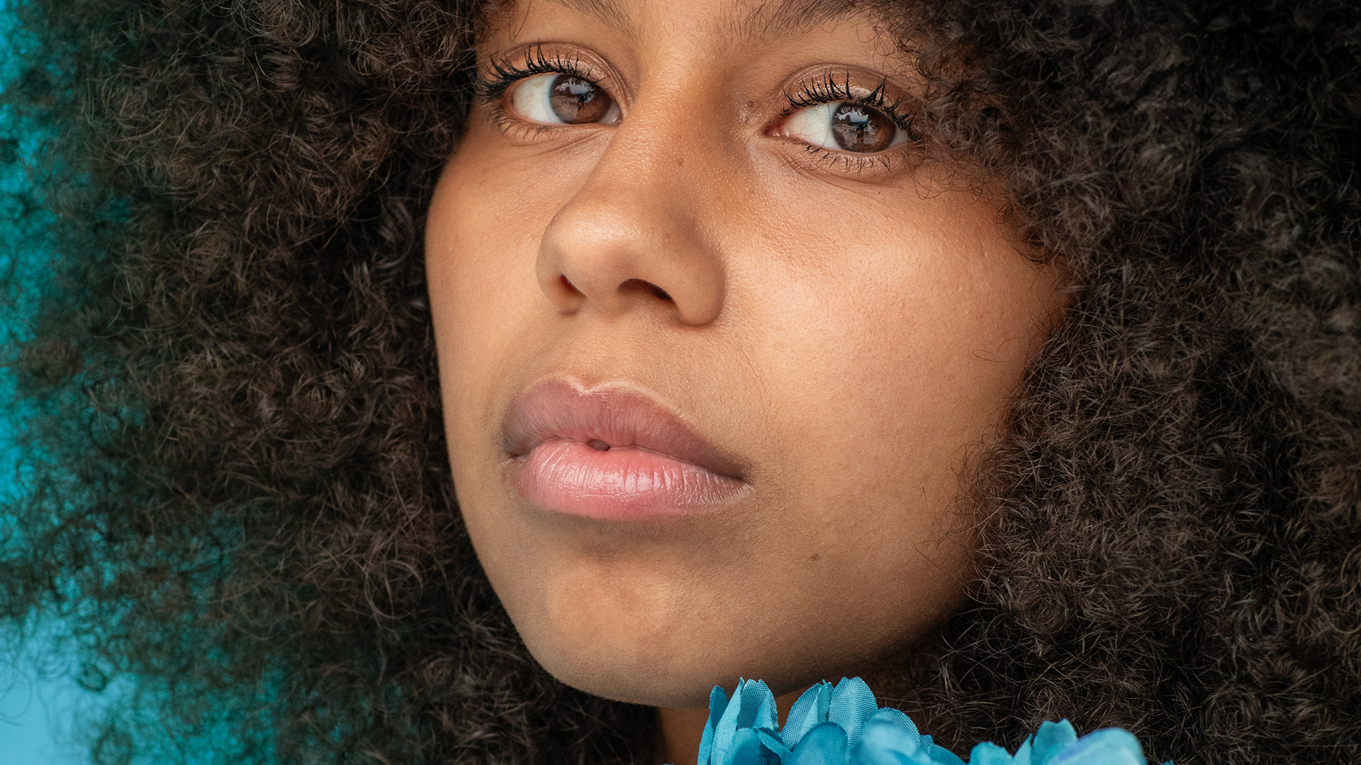
Image Source


Portraits Have One Job: Make Them Look at the Face
A portrait edit has one job: make the viewer look at the face. Almost everything worth doing serves that — brightening the subject slightly, calming anything that competes with them, adding a little detail to the eyes. None of it is dramatic, and the finished result should not look edited at all.
Day 15 works through a full portrait in Lightroom Classic. Every step is a mask, and every adjustment is smaller than you would expect.
Start With Auto
As ever, Auto in the Basic panel is the right opening move on a RAW file. It recovers highlights, opens shadows and adds a little Vibrance, which gets the global tones out of the way so you can concentrate on the local work.
The backslash key gives you the original at any point. On a portrait you will press it constantly, because subtle edits creep.
Fixing a Background That Competes
A bright, saturated background pulls the eye away from a face. The fix is a mask, and the way to build it is not obvious.
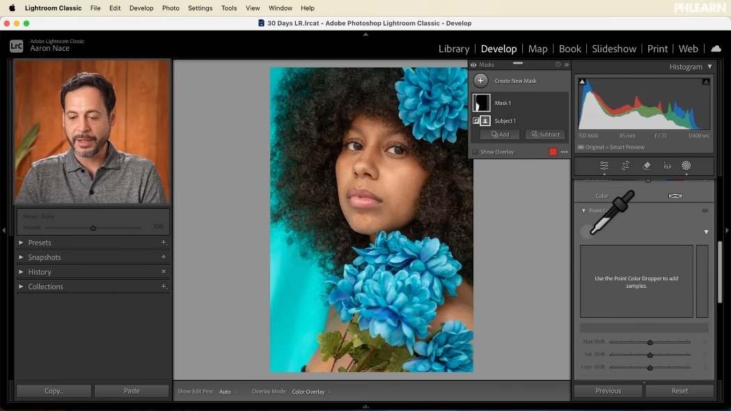
Create a Select Subject mask, then click the three dots beside it and choose Invert. You now have everything except your subject — a far more accurate background selection than Select Background sometimes produces, because it is defined by the subject edge.
Inside that mask you have the full set of adjustments, including Point Color. Sampling the background color and shifting its hue lets you bring a clashing background into agreement with something else in the frame — matching a blue backdrop towards the tone of the flowers your subject is holding, for instance. The colors stop fighting and the picture settles down.
Two Radial Gradients That Do Most of the Work
This pair is the backbone of portrait editing, and it is almost invisible when done gently.
-
Brighten the face
New mask, radial gradient, dragged out over the face and slightly beyond. Raise exposure a little and lift the shadows a little. Genuinely a little — this should be barely perceptible on its own.
-
Darken everything else
New mask, another radial gradient over the same area, then Invert it so it affects everything outside. Drop the exposure slightly and pull the saturation down a touch.
Separately each is nearly nothing. Together they create a soft pool of light around your subject, and the eye goes exactly where you want it. Lowering saturation outside the subject is the underrated half — color attracts attention as strongly as brightness does.
Eyes: the Brush and What Its Settings Do
Eyes are where a portrait is won. Zoom in properly first — hold the space bar to pan, and work at 100%.
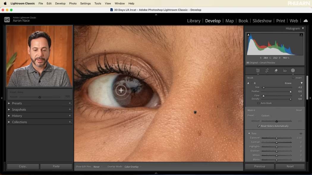
Size — bracket keys, or the slider.
Feather — how soft the edge is. On skin and eyes you want this high. A hard-edged brightening around an iris is instantly visible.
Flow — how much mask each stroke deposits. Low flow builds gradually as you paint over an area repeatedly, which is what makes a blend look natural. This is the setting most worth lowering.
Density — caps the maximum strength of the stroke. Most people leave it at 100 and control everything with flow.
Paint the iris and lift the exposure slightly, with the color temperature nudged warmer. Then check both eyes: one will usually be heavier than the other. Hold Alt or Option to switch the brush to erase and take it back, using the same feather and flow so the correction blends as softly as the original stroke.
Toggling Show Overlay reveals hard edges you cannot see in the adjustment itself.
Sharpening Eyes Without Sharpening Skin
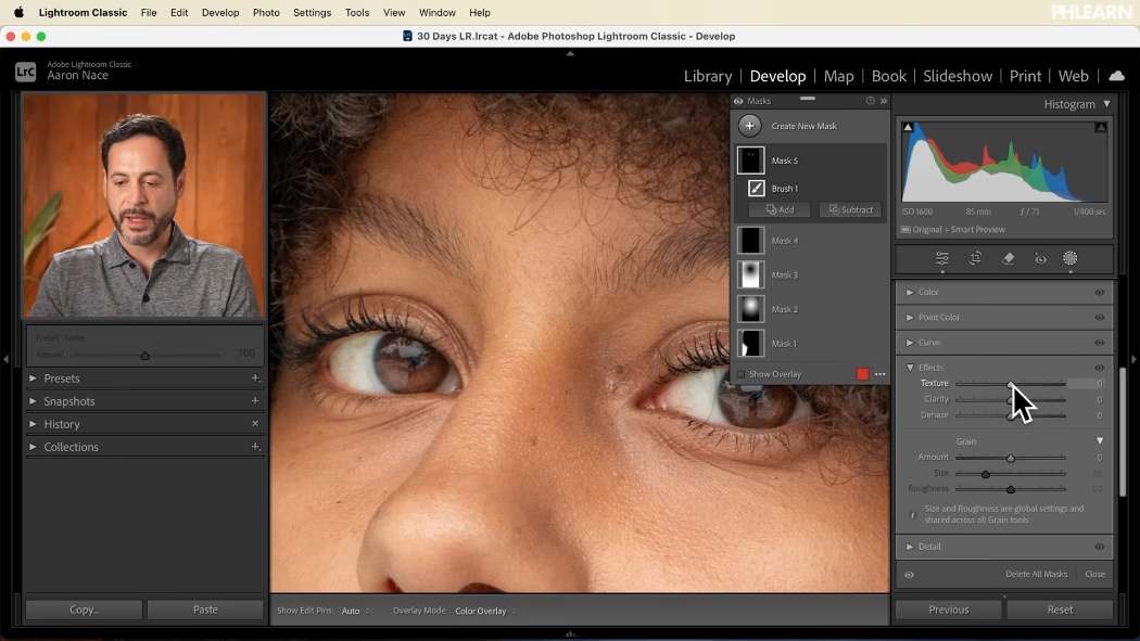
A second brush mask, this time at higher flow, painted only on the lashes, the iris and the lower lash line. Then open Effects within that mask and raise Texture and Clarity.
Stay off the whites of the eye and off the surrounding skin. Sharpening the sclera makes eyes look glassy and unreal; sharpening skin around the eye emphasises every line and fold. The whole reason for masking this rather than using the global sliders is to keep those areas out of it.
Done properly the effect is striking at full size and impossible to point at.
Skin: Healing Brush or Generative Remove
Two tools, and choosing correctly matters.
The healing brush, inside the Remove tool, handles small things — a blemish, a speck of dust, a stray mark. Paint over it and Lightroom samples nearby skin. Fast, and the right choice at the pore level.
For anything larger — an object in the hair, something structural in the frame — switch on Use Generative AI, paint the whole object, and click Remove. It generates replacement content and offers variations to choose between.
The rule of thumb: healing for blemishes, generative for objects.
Where This Usually Goes Wrong
Brightening the face too much. A face noticeably lighter than its surroundings reads as a cut-out. Small moves, checked against the original.
Over-sharpening eyes. Texture and Clarity on the whites is the fastest way to make a portrait look artificial.
Painting at full flow on skin. Every stroke shows. Lower the flow and build.
Retouching at 100% and never zooming out. Work close, judge at fit. Things that seem essential at 200% are invisible at normal viewing size.
Forgetting the background. Half of drawing attention to a face is removing attention from everything else.
Take It From Here
Nothing in this edit is a big move. A background brought into agreement, a face a shade brighter, surroundings a shade darker, eyes with a little more life, a few marks gone. The finished portrait looks like a better photograph rather than a retouched one, which is the entire point.
Tomorrow we go outside: editing landscapes in Lightroom Classic.
For portrait retouching taught in order, our PRO Portraits Learning Path is where to go next.
Quick Reference: Keys, Menus and Settings
- StartBasic panel > Auto; \ for before and after
- Recolor the backgroundMasking > Select Subject, three dots > Invert Mask; Point Color: sample the color and shift Hue
- Light the faceRadial Gradient on the face: Exposure and Shadows up a little; second Radial Gradient, inverted: Exposure and Saturation down a little
- Zoom and brushHold Space to pan, Cmd/Ctrl + + to zoom; [ and ] for brush size; Feather high, Flow low
- Erase the brushHold Alt/Option; Show Overlay to spot hard edges
- Sharpen the eyesBrush the lashes and iris only, then Effects: Texture and Clarity up
- RetouchRemove tool: healing brush for blemishes; Use Generative AI, paint the object, Remove, then pick a variation
Free Downloads
Follow Along on the Same RAW File
Get the portrait RAW file from the tutorial, with a bright background to calm, eyes to enhance and small marks to remove. Free with a PHLEARN account.
Portrait Editing in Lightroom: Common Questions
Where should I start when editing a portrait in Lightroom?
Click Auto in the Basic panel. It recovers highlights, opens the shadows and adds a little Vibrance, so you can spend your time on masks. Press the backslash key often to compare with the original.
How do I select only the background behind my subject?
Create a Select Subject mask, click the three dots beside it and choose Invert Mask. The mask now covers everything except the subject.
How do I change a background color so it doesn’t distract?
Inside the inverted background mask, open Point Color, sample the background color and shift its Hue. In the tutorial the blue backdrop is moved toward the color of the flowers she is holding.
How do I draw attention to the face?
Drag a radial gradient over the face and raise Exposure and Shadows a little. Add a second radial gradient over the same area, invert it, and lower Exposure and Saturation a little outside the face.
What do Feather, Flow and Density do on the Lightroom brush?
Feather softens the edge of the stroke. Low Flow builds the effect slowly as you paint over an area again, which blends more naturally. Lower Density mostly affects the center of the stroke; Aaron leaves it all the way up.
How do I erase part of a brush mask?
Hold Alt/Option and the brush switches to erase, with the same Feather and Flow. Turn on Show Overlay to find hard edges you need to soften.
How do I sharpen the eyes without sharpening the skin?
Paint a new brush mask over only the lashes, the iris and the lower lashes, then raise Texture and Clarity in the mask’s Effects. Stay off the whites of the eyes and the skin around them.
How do I remove blemishes in Lightroom Classic?
Open the Remove tool, choose the healing brush and paint over the spot. It is the right tool for small marks, dust and blemishes.
How do I remove something bigger, like an object in the hair?
In the Remove tool, turn on Use Generative AI, paint over the whole object and click Remove. You can click through the variations to pick the most natural one.
Is the sample file free?
Yes, with a free PHLEARN account. You get 1 sample RAW file: the portrait edited in the tutorial.
Master Photoshop, Lightroom and Photography
Join PHLEARN PRO for $12.99 a month or $99.99 a year. Cancel anytime, with a 100% money-back guarantee.





