Free Tutorials – Photoshop & Lightroom


Discover the power of graphics in Photoshop! Blend photography, illustrations, and textures across six unique projects using advanced masking, 3D compositing, and the newest editing tools.
Photoshop | Graphics & Text | Medium | 3 hours | 7 videos
25 Sample Images | 7 Sample PSDs


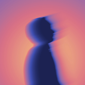
Create a high-end light blur effect using Path Blur and Smart Objects. Add motion and texture to your portraits while keeping everything non-destructive.
Photoshop | Visual Effects | Medium | 15 mins | 1 video
3 Sample Images | 1 Sample PSD

Learn how to remove distractions in one click using the updated AI-powered Remove Tool in Photoshop. Plus stay organized with the new Cleanup Layers feature.
Photoshop | Photo Editing | Easy | 15 mins | 1 video
1 Sample Image | 1 Sample PSD
Stop worrying about permanent mistakes! Discover our non-destructive workflow using masks, smart objects, and more to transform your images while keeping original pixels perfectly safe. This tutorial includes both JPEG and RAW files, so you can follow along.
Photoshop | Workflow | Medium | 2.25 hours | 4 videos
14 Sample Images | 13 Sample PSDs

Create the perfect film look! Learn how to use masks and textures to make your photos look like real film. We’re even giving away a free drag-and-drop PSD with three realistic border styles so you can get amazing results fast!
Photoshop | Visual Effects | Easy | 15 mins | 1 video
5 Sample Images | 1 Sample PSD
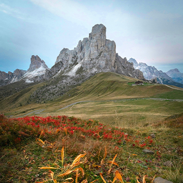
Learn how to use Photoshop 2026’s new Clarity and Dehaze adjustment layer to instantly cut through atmospheric fog and restore incredible detail to your photos.
Photoshop | Photo Editing | Easy | 15 mins | 1 video
1 Sample Image | 1 Sample PSD

Learn how to transform photos using realistic textures, blending modes, and non-destructive color grading in Photoshop for a professional, high-quality finish.
Photoshop | Visual Effects | Medium | 15 mins | 1 video
4 Sample Images | 2 Sample PSDs

Create stunning double exposures in Photoshop 2026! Learn to blend high-contrast images with Screen mode and use Generative Expand for the perfect fit.
Photoshop | Visual Effects | Medium | 15 mins | 1 video
3 Sample Images | 1 Sample PSD

Stop worrying about permanent mistakes! Discover our non-destructive workflow using masks, smart objects, and more to transform your images while keeping original pixels perfectly safe. This tutorial includes both JPEG and RAW files, so you can follow along.
Photoshop | Workflow | Advanced | 4.75 hours | 11 videos
29 Sample Images (JPEG Files) | 7 Sample Images (RAW Files) | 16 Sample PSDs
Learn to change any color in Photoshop while keeping skin tones natural! Use Hue/Saturation and masking to add professional gradients for a stunning multi-tone look.
Photoshop | Visual Effects | Medium | 15 mins | 1 video
1 Sample Image | 1 Sample PSD

Master advanced masking and coloring across all Lightroom apps! This course covers mask logic, light balancing, and professional color grading, with Photoshop techniques included for those who need ultimate creative control.
Lightroom | Workflow | Medium | 3.75 hours | 10 videos
9 Sample Images
Master Lightroom Mobile’s AI Quick Actions to instantly clear skin. Use the new Blemishes tool and amount slider for professional, natural retouching results on the go.
Lightroom | Retouching | Easy | 15 mins | 1 video
1 Sample Image | 1 Sample PSD
Learn how to create a vibrant and stylized glow effect in Photoshop! Master professional techniques for adding artistic motion, custom gradients, and cinematic color to your work.
Photoshop | Visual Effects | Medium | 15 mins | 1 video
2 Sample Images | 1 Sample PSD
Discover the world of advanced compositing! Master manual lighting, masking, and color matching across four projects. This tutorial includes sample images, and even two exclusive brushes, so you can follow along!.
Photoshop | Compositing | Advanced | 3.25 hours | 5 videos
13 Sample Images | 2 Photoshop Brushes

Learn to use Adobe’s new AI Landscape Masking tool to automatically edit snow. This tutorial covers Lightroom and Photoshop workflows for professional, flexible landscape results in seconds. We’re even including a RAW file, so you can follow along.
Photoshop | Photo Editing | Easy | 15 mins | 1 video
1 Sample Image (RAW File)

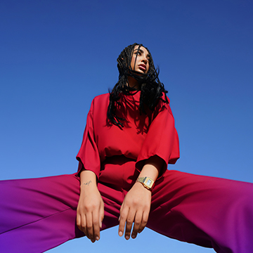
Learn how to create a stunning, colorful aura effect in Photoshop! Master vibrant glows, professional motion blurs, and texture blending to turn your portraits into beautiful edits.
Photoshop | Visual Effects | Medium | 15 mins | 1 video
8 Sample Images | 1 Sample PSD

Stop wasting AI credits!This tutorial reveals exactly which Photoshop and Lightroom AI tools cost credits, and which ones are totally free. We’ll even show you how to track your balance and expert strategies to maximize your monthly usage.
Lightroom, Photoshop | Photo Editing | Easy | 30 mins | 1 video
1 Sample Image | 1 Sample PSD

Master 2026’s Photoshop and Lightroom AI updates, from Harmonize to Assisted Culling we cover it all. This pro tutorial includes 30 practice images including 3 RAW files to perfect your workflow.
Lightroom, Photoshop | Photo Editing | Advanced | 2 hours | 14 videos
26 Sample Images (JPEG Files) | 3 Sample Images (RAW Files) | 8 Sample PSDs | 2 Sample Videos